A creative-tech workshop platform.
Design task · conceptA two-sided web app for a teen creative-technology program — the kind of place where 12–18-year-olds take hands-on workshops in animation, game design, music, and film. I designed both halves: the student experience for browsing workshops, learning inside a session, and submitting projects; and the workshop-leader experience for running live sessions, taking attendance, and giving feedback. Light and dark themes throughout.
One platform, two very different users.
This started as a design task for a creative-technology education program — a free, project-based learning center for teenagers, where 12–18-year-olds rotate through hands-on workshops in things like animation, game design, filmmaking, music, and 3D. The product had to serve two people whose days look nothing alike: the student who shows up to learn and make something, and the workshop leader who runs the room.
The brief was effectively “design the platform both of them use.” That meant resolving one product into two coherent experiences that share a language but optimise for opposite jobs — discovery and focus on one side, control and throughput on the other. I've de-branded the work here for my portfolio; the brand it was made for isn't shown.
The design tension I kept coming back to: a teenager wants the platform to feel like a place worth spending time in. A workshop leader wants it to get out of the way. Both have to live in the same visual system.
The system
I built it on a warm, friendly, rounded base — generous radii, soft pastel surfaces, a confident accent, and big readable type — so it reads as for teenagers without tipping into childish. A light and a dark theme are first-class, not an afterthought, because creative work happens at all hours. A persistent left rail carries identity and the gentle gamification (awards, badges, notifications) that keeps students coming back. Everything below is built from that one kit.
For the person who shows up to make something.
The student's job is to find a workshop, learn inside it, and hand in their project. Everything here is tuned to make that loop feel motivating rather than administrative.
A home that feels like progress.
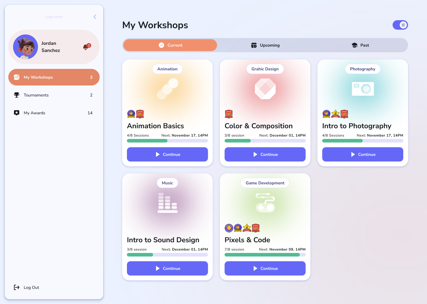
The dashboard leads with the workshops a student is already enrolled in — each as a soft, colorful card showing where they are, what's next, and when the next session lands. The left rail is the constant: avatar, notifications, and the awards and badges that turn a course into a streak worth keeping. The whole thing ships in light and dark, switchable from the header.
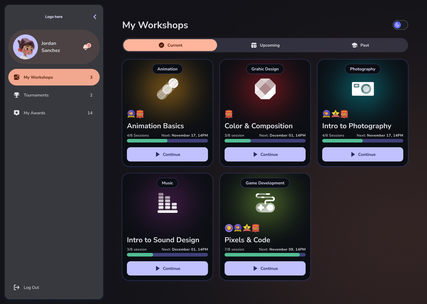
The same dashboard, both themes. Dark mode isn't an inverted afterthought — surfaces, card colors and contrast were re-tuned so the playful warmth survives the switch.
Upcoming and past, at a glance.
Beyond what's in progress, students need to see what's coming and look back at what they've finished. Simple tabbed views split the workshop list into upcoming and past without ever leaving the same comfortable grid — the past view doubles as a record of everything they've made.
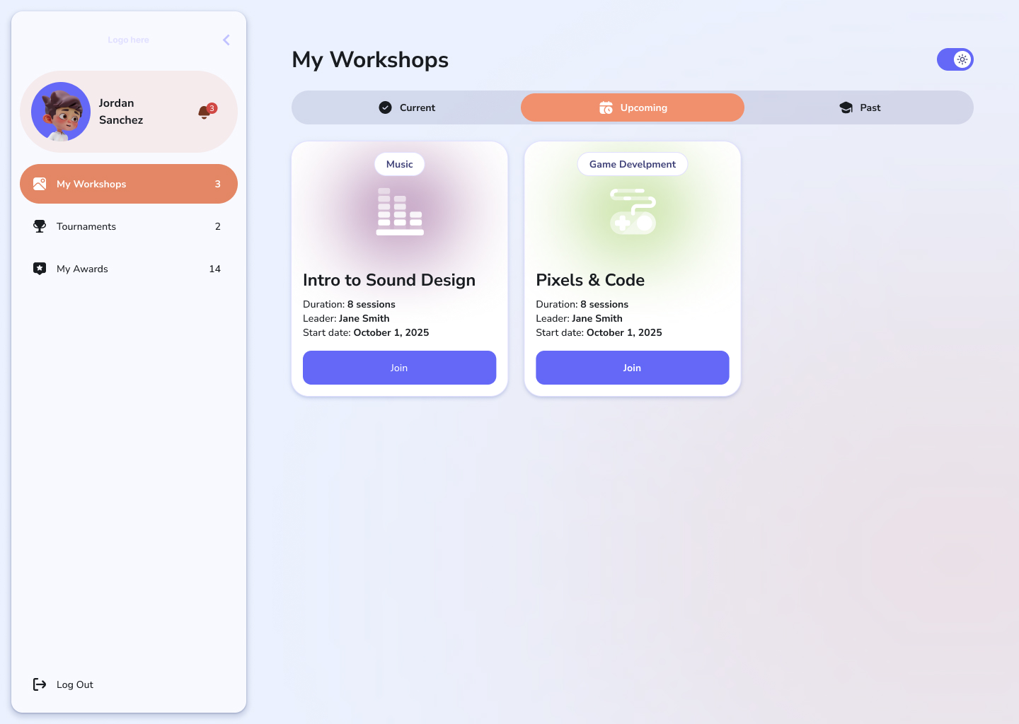
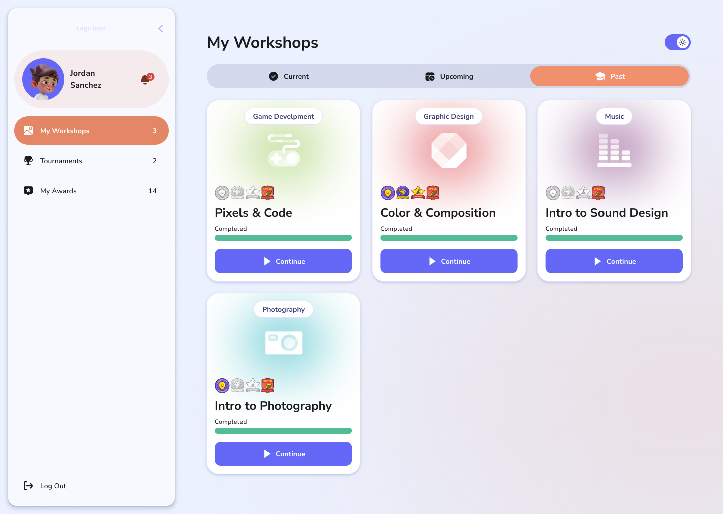
Upcoming and past as tabs on the same grid — discovery, current work, and a portfolio-of-sorts all live in one consistent place.
A workshop is a sequence of sessions.
Open a workshop and it breaks down into its sessions — the weekly building blocks, each with its own learning materials, task, and submission. The list makes the arc of the course legible: what's done, what's live, what's still ahead.
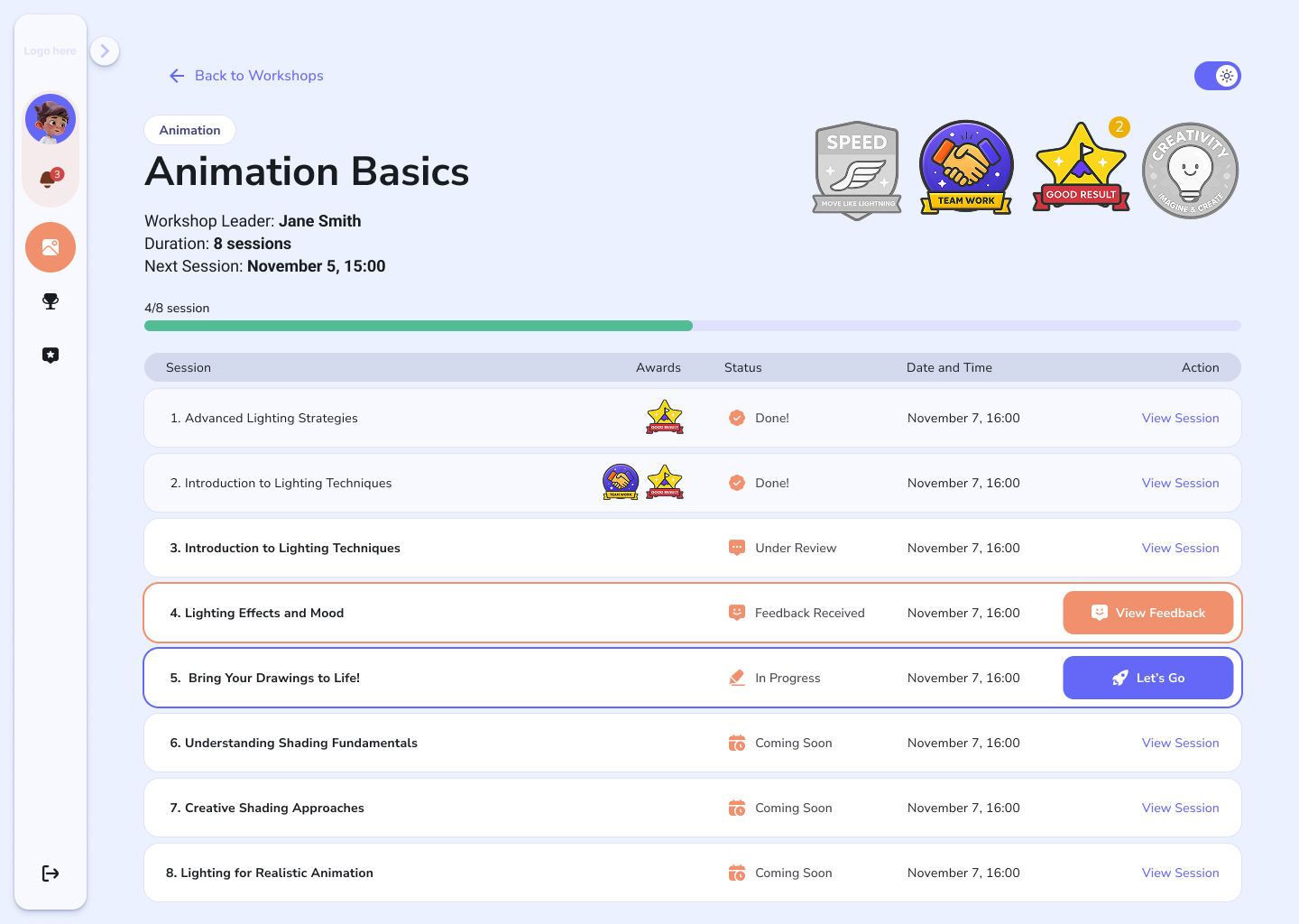
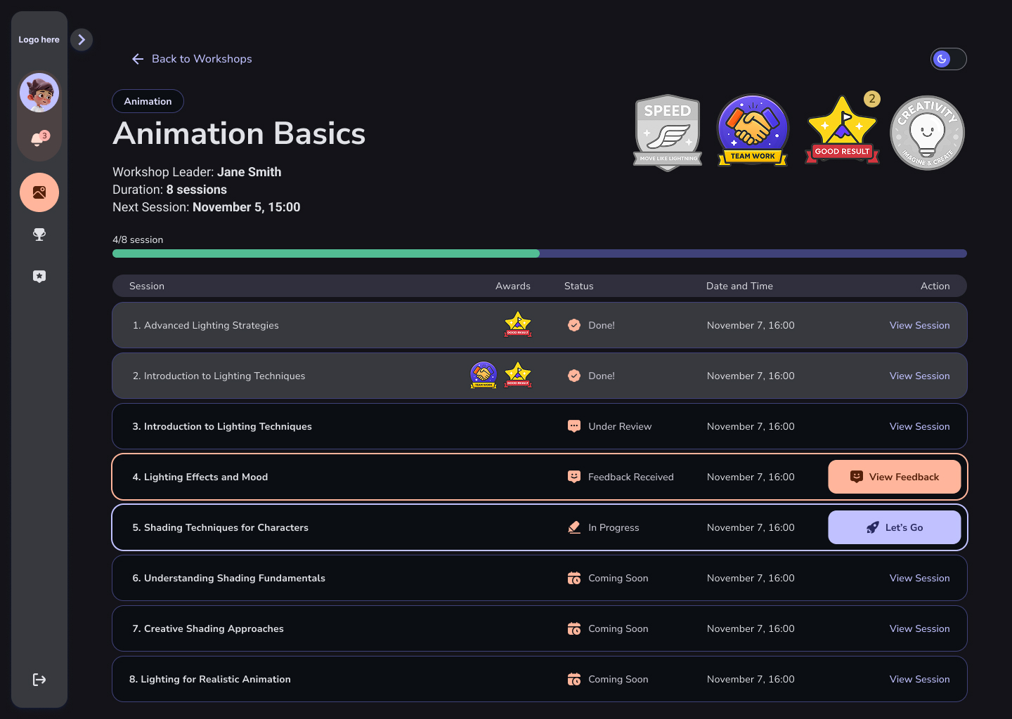
The session list is the spine of a workshop — it has to show progress and sequence at a glance, in either theme.
Everything for one session, in one scroll.
The session page is where the actual learning happens, so it carries a lot without feeling heavy. A right-hand mini-nav tracks the parts — what you'll learn, the tools, the task, tips, the science, the submission — while a progress bar (“Halfway there!”) keeps momentum visible. Video, reference imagery and downloadable materials sit inline, so a student never has to leave to do the work.
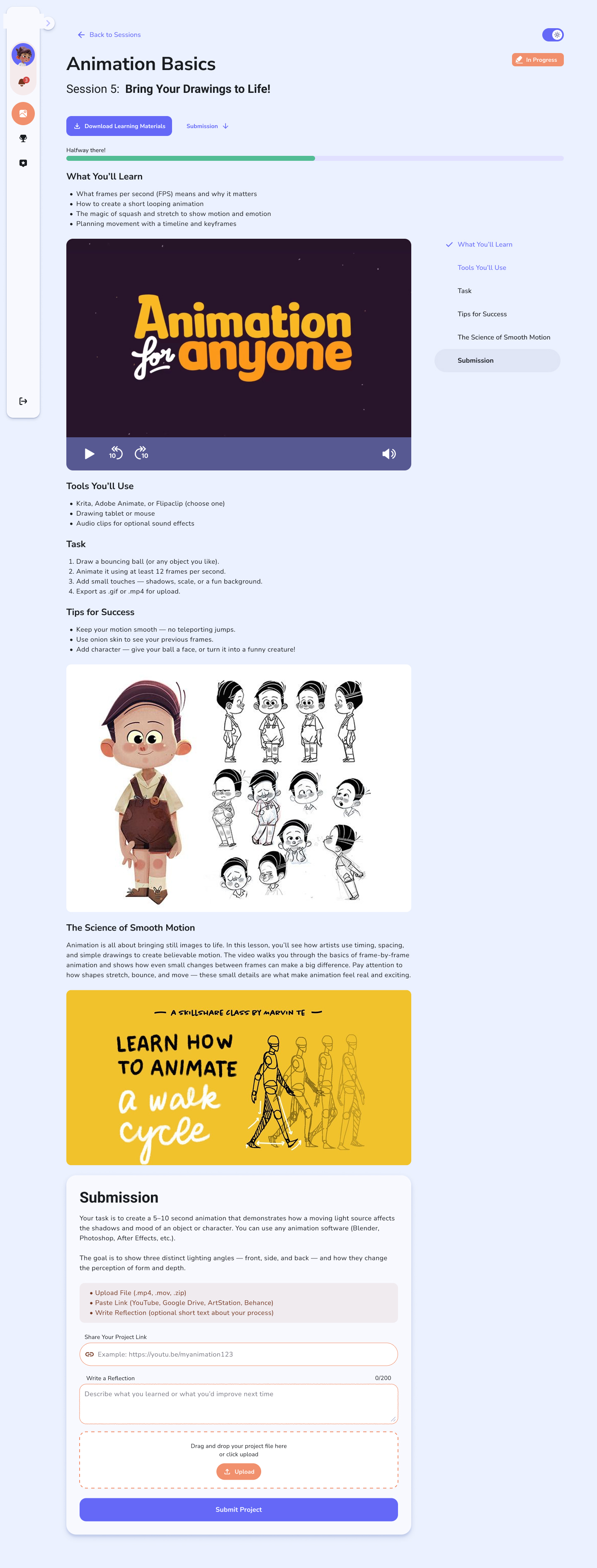
One session, top to bottom — learn, watch, reference, then submit, with a sticky outline on the right so a long page never feels lost. The progress bar turns a lesson into a sense of momentum.
Submit, then hear back.
The payoff of every session is turning something in and getting a response. I designed the submission as a small three-state flow: an open form that accepts a file or a link plus an optional reflection; a confirmed “sent” state that shows exactly what was submitted; and the moment that matters most — feedback received, where a leader's written notes appear at the top and the session flips to “Done.”
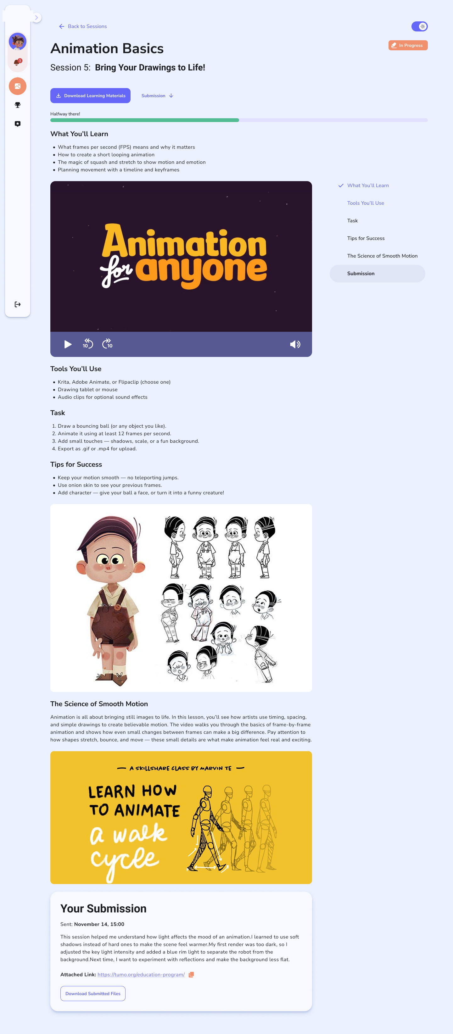
The confirmed state. After submitting, the student sees a clear receipt of what they sent — reflection, attached link and files — so there's no ambiguity about whether it went through.
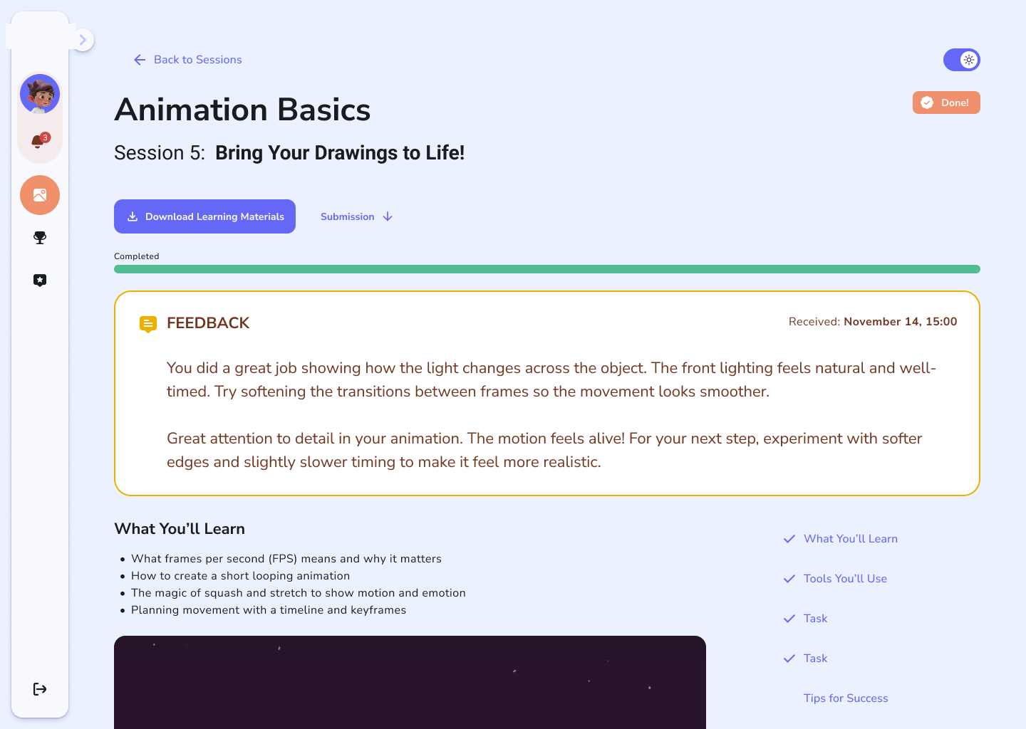
The reward. Feedback lands in a warm, can't-miss card at the very top, the progress bar fills to “Completed,” and the status flips to Done — closing the loop on the whole session.
For the person running the room.
Same platform, opposite job. The leader needs to manage a roster, run live sessions, mark who showed up, and give feedback fast — across many students at once. Here the design trades playfulness for density and control.
The leader's command center.
The leader's home is denser by design — their workshops, the sessions inside each, and the students enrolled, all reachable quickly. It shares the rounded, warm language of the student side so the product still feels like one thing, but it surfaces the controls a teacher reaches for first: roster, schedule, and the state of each session.
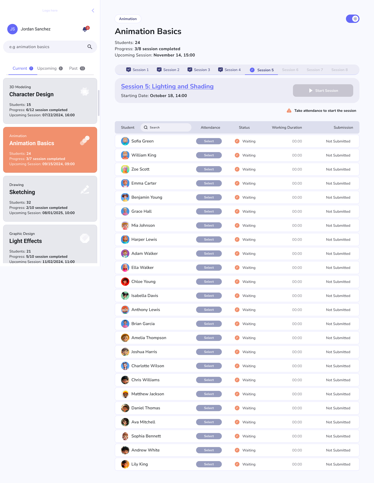
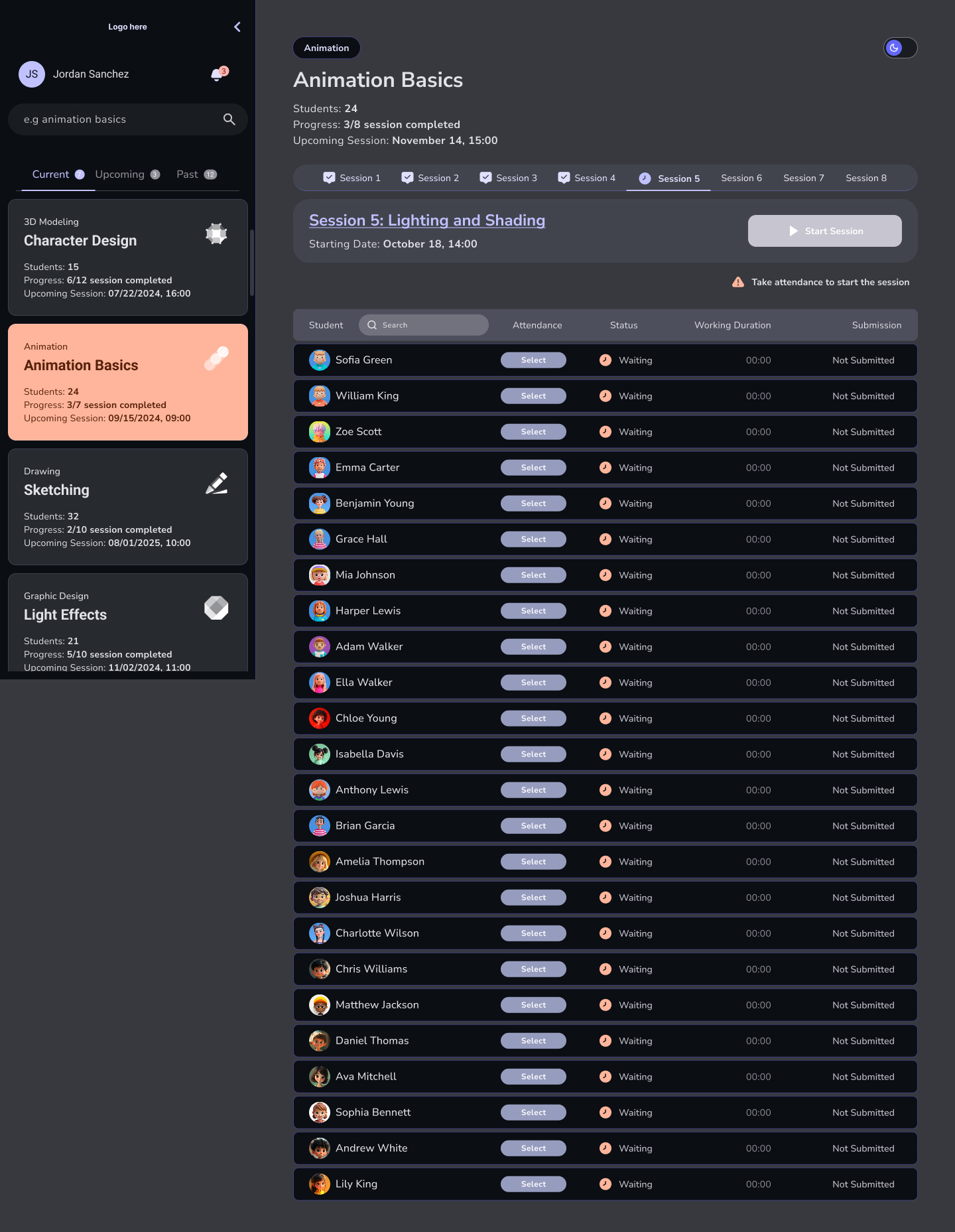
The leader's main view, both themes — more information per screen than the student side, but built from the same components so it never feels like a different app.
Taking attendance without breaking stride.
At the start of a session a leader marks who's here — a small, repetitive task that has to be fast and forgiving. I designed it as a quick pass through the roster with an unmistakable “complete” confirmation, so a teacher can do it in the first minute and get back to teaching.
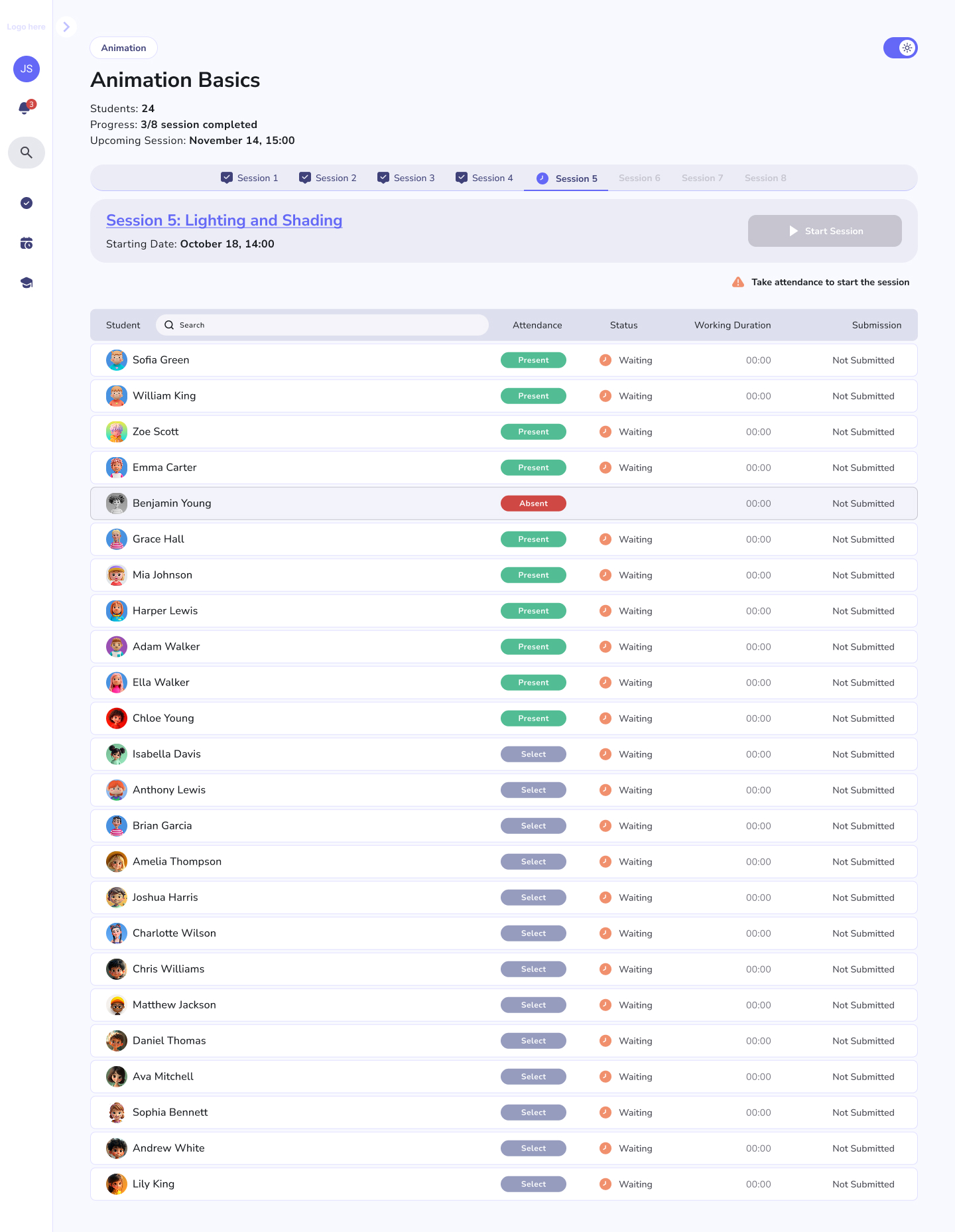
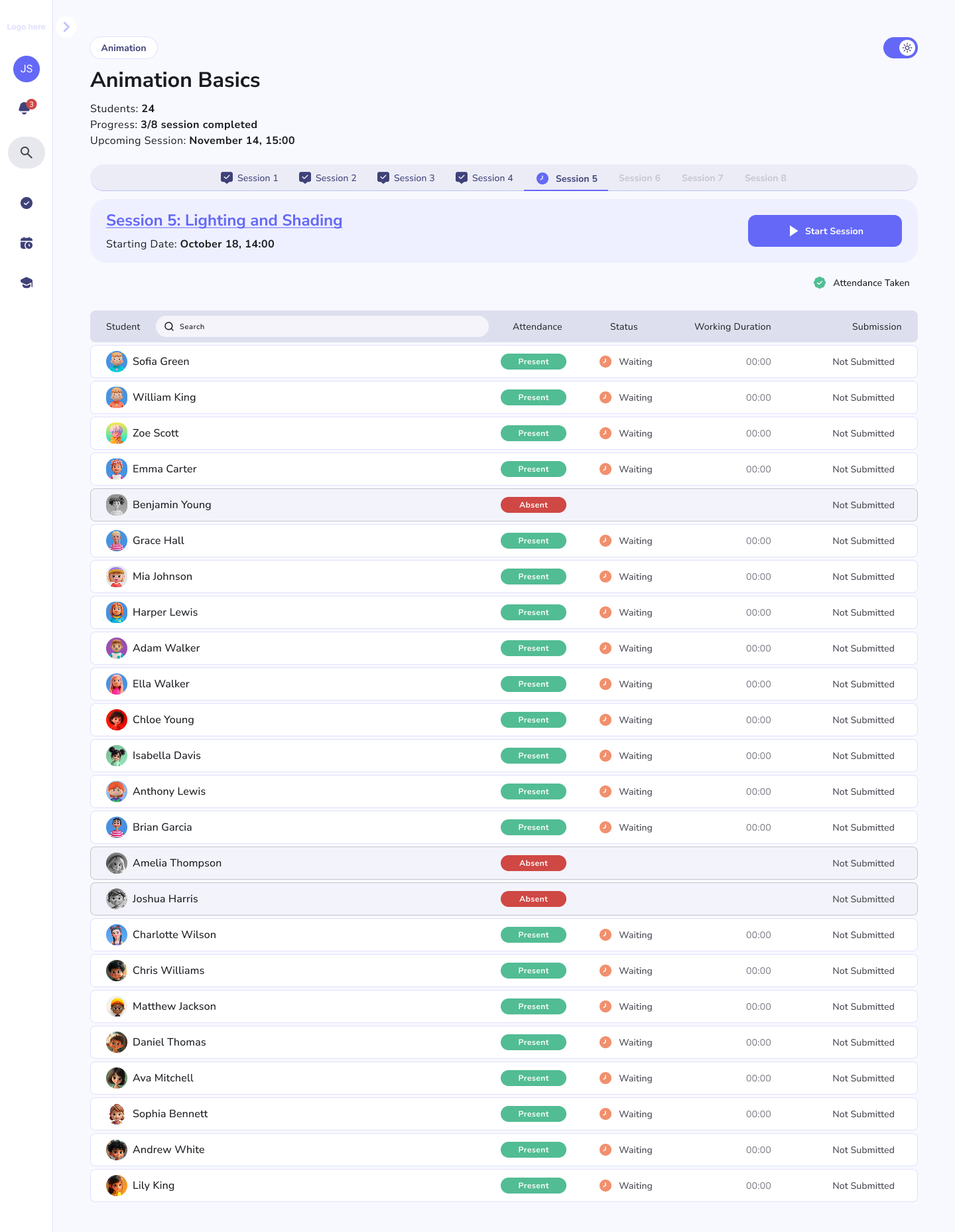
Mark, confirm, done. A clear completion state matters for the small jobs too — it tells the leader the task is finished and won't need revisiting.
A session has states, and the UI tracks them.
From the leader's seat, a session moves through a lifecycle — upcoming, in progress, ended — and the interface should always make the current state obvious and offer only the actions that make sense right now. The “in progress” view foregrounds running the room; once it's over, the view shifts to wrap-up and review.
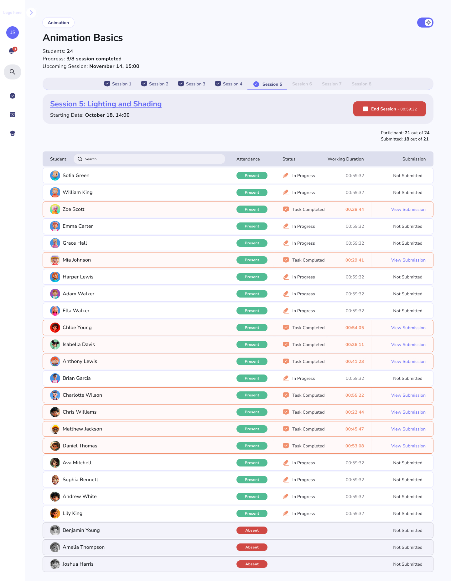
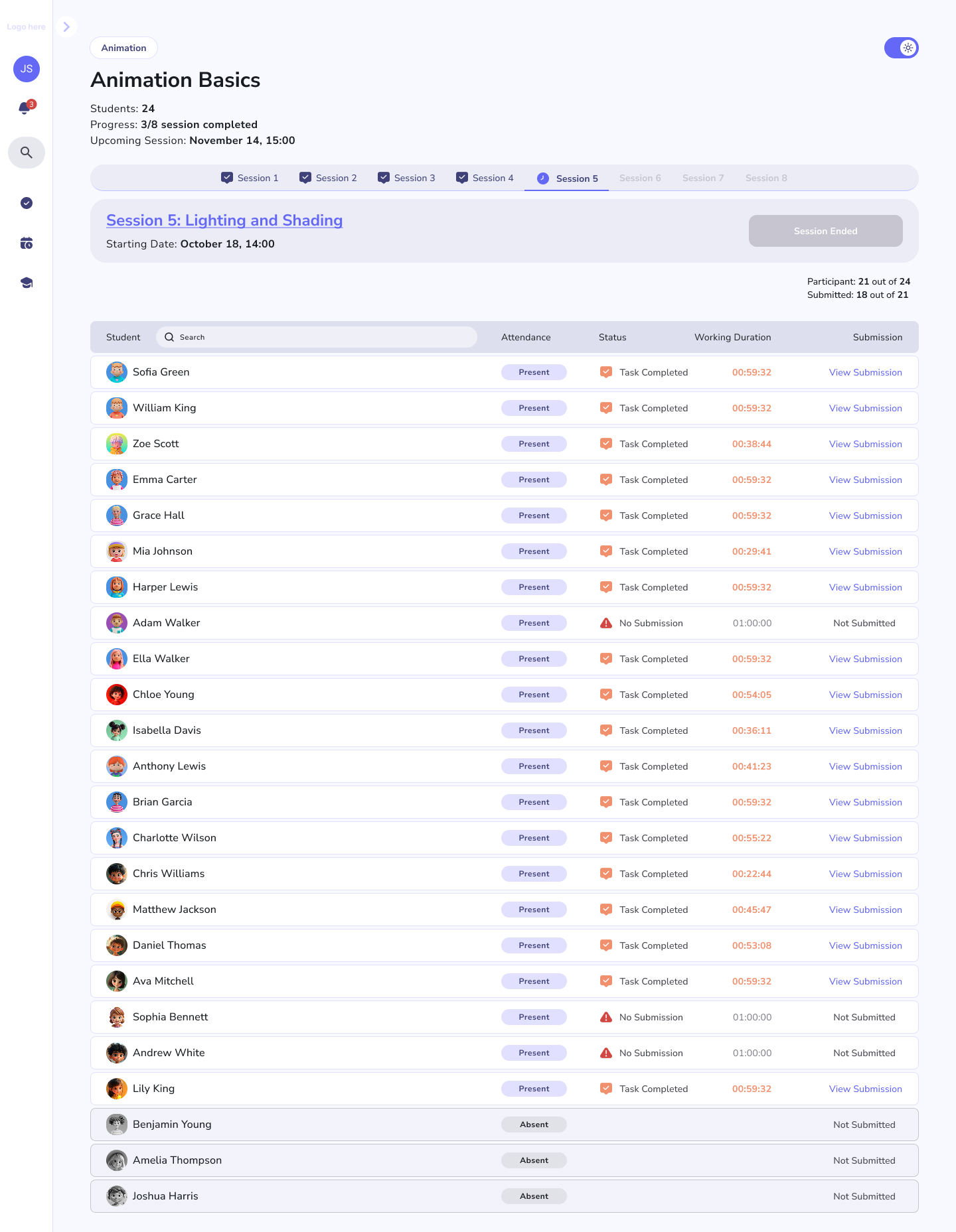
Live vs. ended. The same session changes its affordances with its state — what you can do mid-session is different from what you do after, and the screen reflects that.
Reviewing work is the leader's other half.
The flip side of a student's submission is the leader's review queue. A “new submission received” state pulls a fresh hand-in to the top with everything needed to assess it — the student's files, link and reflection — and a place to write the feedback that shows up on the student's session. Past submissions stay accessible so a leader can track one student over time.
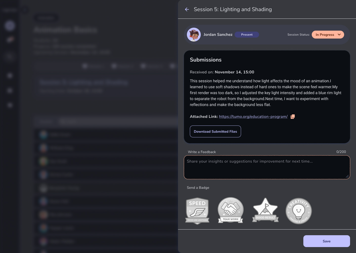
A new submission, ready to review. Everything the leader needs to respond — the work, the context, and the feedback field — is on one screen, so giving good feedback is the path of least resistance.
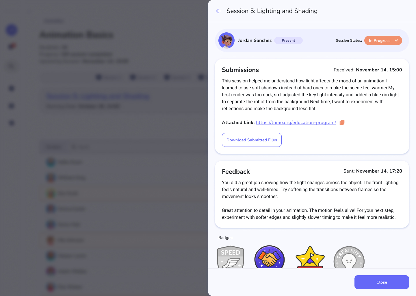
And the same screen for a past submission — a record of work already reviewed, so a leader can follow one student's progress across a whole workshop.
One kit, two jobs, eighteen screens.
The thing I'm proudest of isn't any single screen — it's that the playful student side and the dense leader side are visibly the same product, built from one component kit and one type scale, each theme carried all the way through. The hard part of a two-sided tool is keeping it coherent while letting each side optimise for its own job; that's the problem this design solves.
What I'd carry forward
Designing both sides at once is a good forcing function: every student action has a leader consequence, and you can't fake the seam between them. A submission isn't done until you've also designed the review that answers it; attendance isn't done until you've designed the state that says it's complete. Holding both halves in view at the same time is exactly the systems discipline I want to keep bringing to product work.
Happy to walk through the full flows, the theming system, or the student-vs-leader trade-offs in a conversation.
Get in touch →Like what you see?
I'm open to senior product design roles and select freelance engagements. Always happy to chat.
Get in touch →