30+ landing pages, one coherent system.
How I designed dozens of marketing landing pages across video tools, mockups, programs, and features at Renderforest — flexing one brand system into many distinct moods without breaking it.
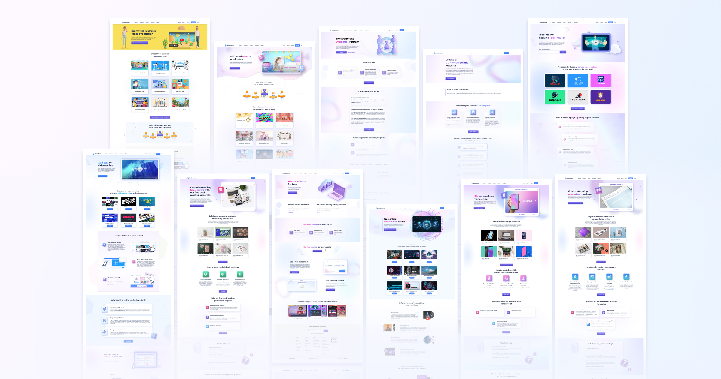
One brand, dozens of pages, no two products quite the same.
Renderforest is a sprawling creative platform — video makers, logo makers, mockup generators, website builders, programs for partners and ambassadors, infrastructure pages like hosting and GDPR compliance. Every category has its own audience, its own vocabulary, its own mood.
The marketing team was shipping new landing pages constantly to support launches, SEO, and category expansion. The challenge wasn't producing pretty pages — it was producing them fast, while keeping them recognizably Renderforest, and giving each one enough personality to suit its product.
Too rigid a system and every page would look the same. Too loose and the brand would dissolve. The work was finding the line in between — and holding it across 30+ pages.
Designer for marketing landing pages, end to end.
I owned the design from brief to handoff for each landing page I worked on, partnering closely with the marketing and content teams. Day to day that meant:
- Interpreting marketing briefs into clear visual hierarchies — what the hero needed to say in 3 seconds, where the proof points lived, how to lead to the CTA.
- Designing in Figma using a shared library of templates, sections, and components I helped maintain.
- Crafting category-specific moods — colors, illustrations, 3D assets — that still read as part of one family.
- Handing off responsive specs to engineering and reviewing the implementation.
System first, expression second.
The pace required a systems approach. Rather than designing each landing page from a blank canvas, I worked within a shared architecture: hero with illustration or product preview, social proof, templates or features grid, a three-step "how it works", FAQ, CTA, footer. Almost every page used those bones.
The interesting design work happened within that frame — choosing the right illustration style for each product, deciding when to break the pastel palette for a bolder color (Animated Explainer's yellow, Music Video Maker's dark neon), and figuring out which 3D assets sold the product without overcrowding the hero.
Templates as a craft tool, not a shortcut. A common trap with landing-page systems is letting them flatten the work. I treated the template library as a starting point — the structure that let me ship fast — and put the energy into the moments that mattered most: the hero composition, the typographic hierarchy, the illustration choice, and the small details (motion accents, hover states, micro-decorations) that gave each page its own feel.
Working with marketing. Every page started with a conversation about the campaign's job. What's the audience expected to do? What's the one sentence we want them to remember? That clarity made the design decisions much easier — and meant my drafts came back from review with fewer rounds.
12 of 30+ landing pages.
Each one shipped to support a different category, audience, or campaign. Seen together, they're a portrait of how a coherent system can host real range.
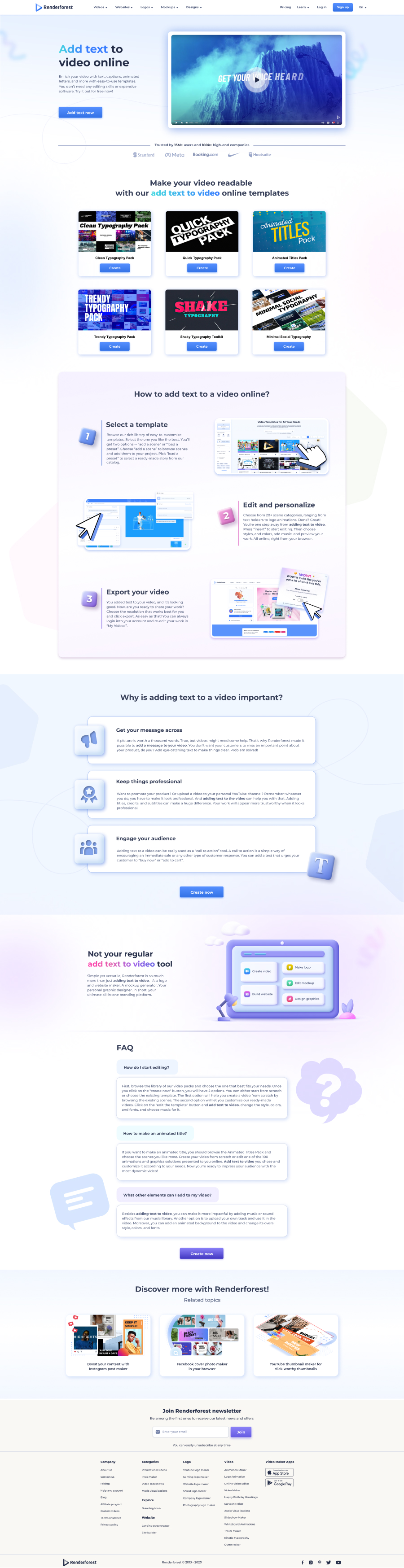
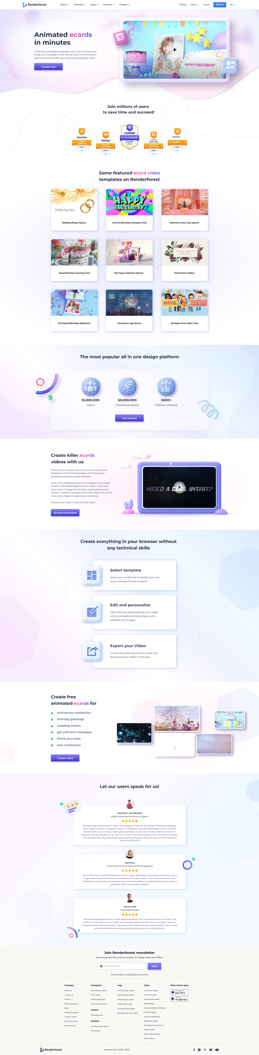
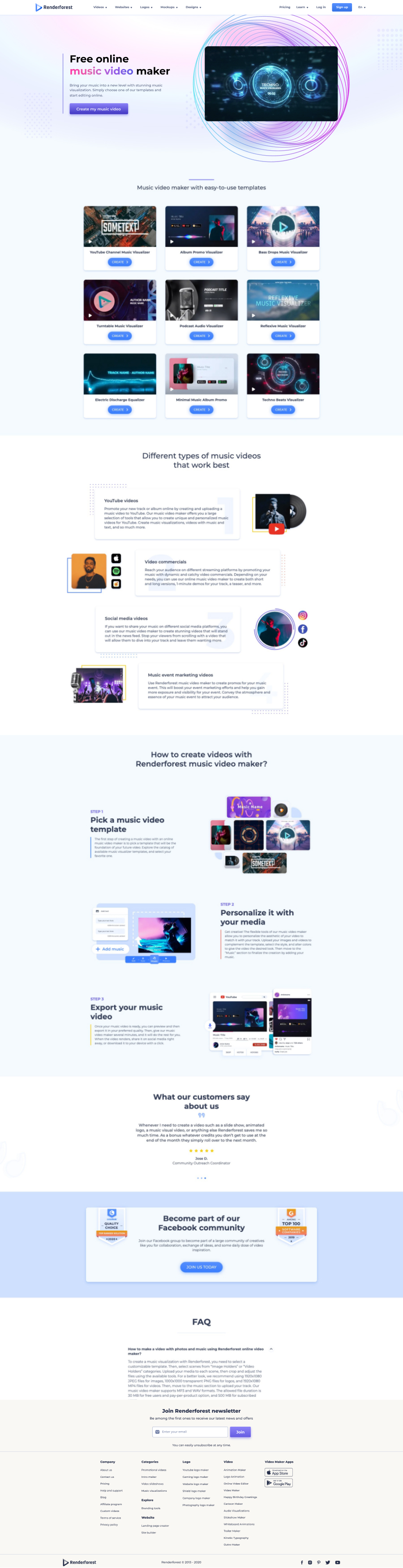
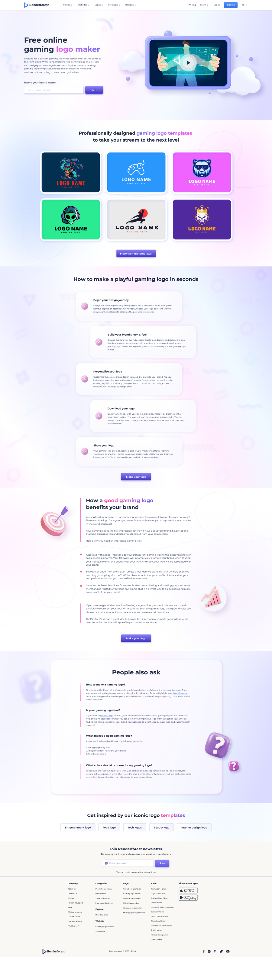
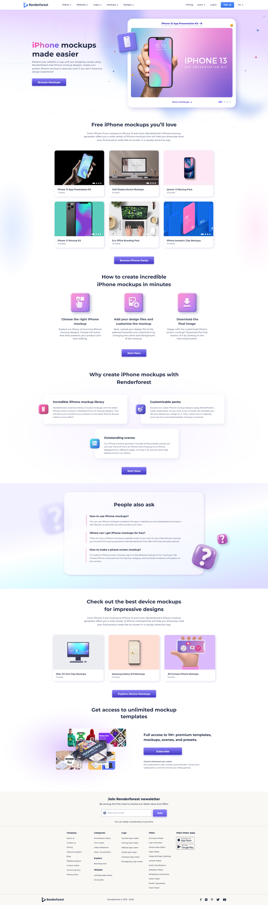
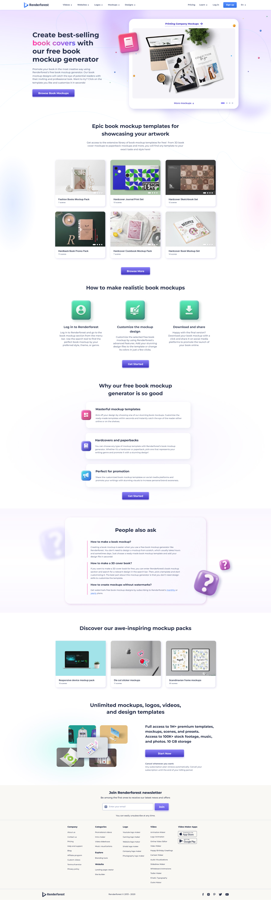
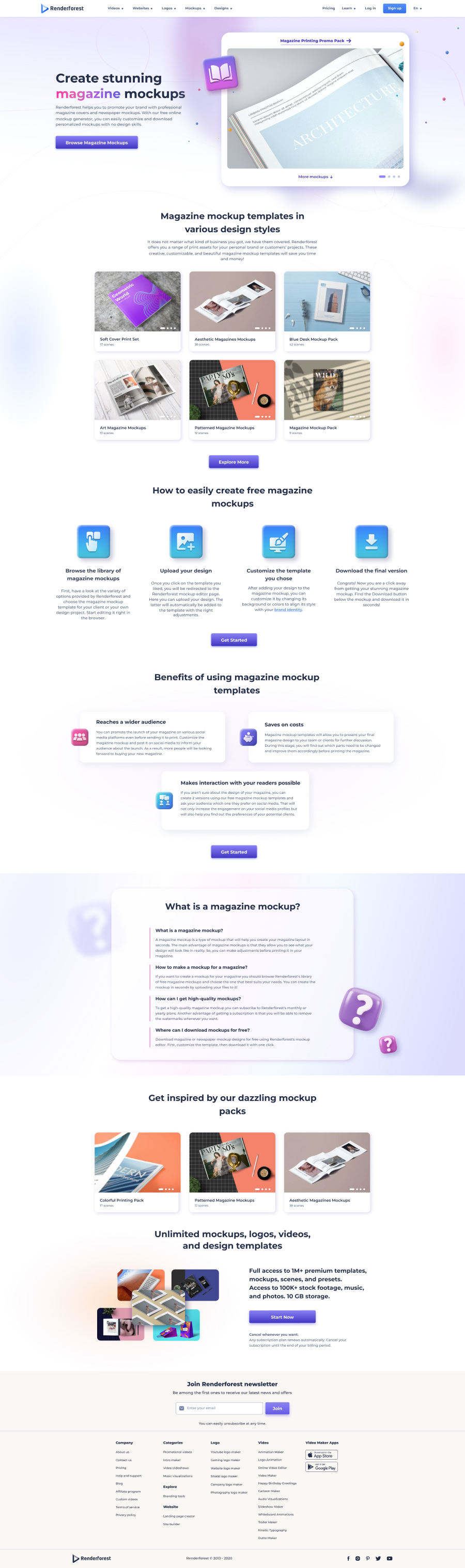
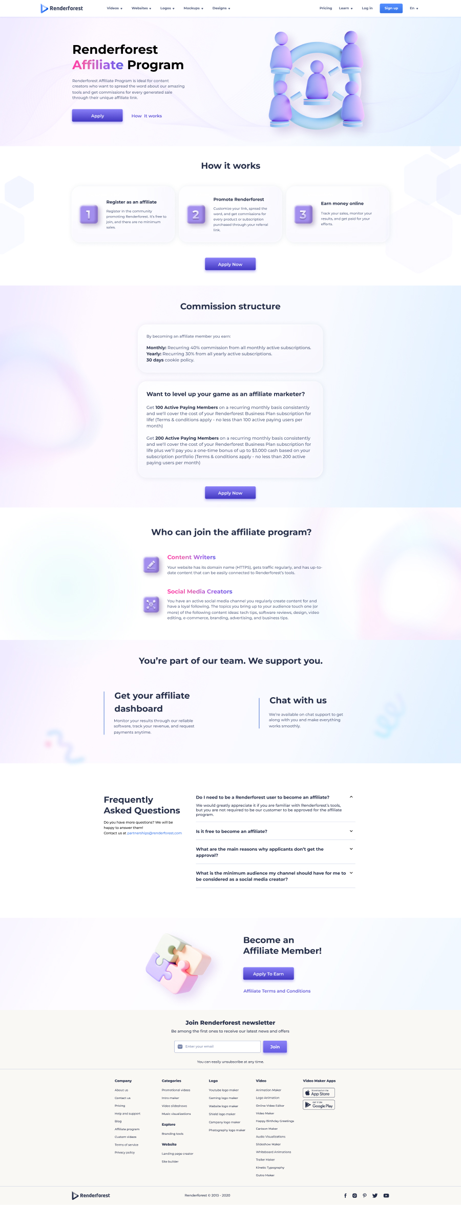
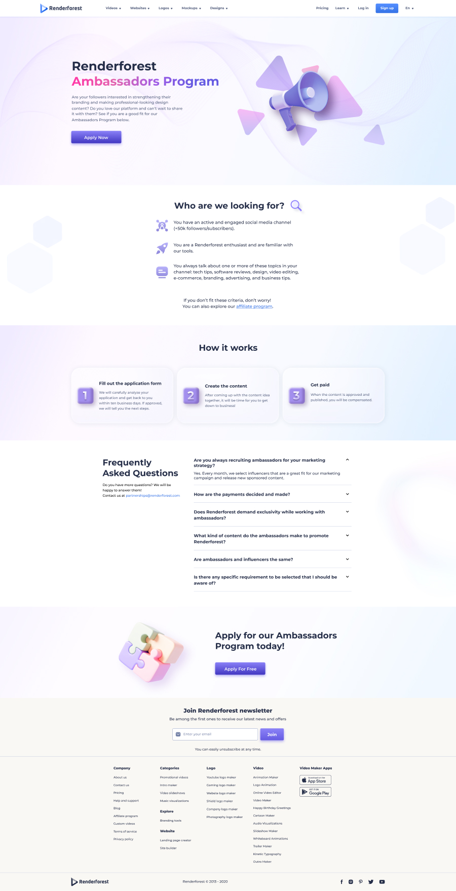
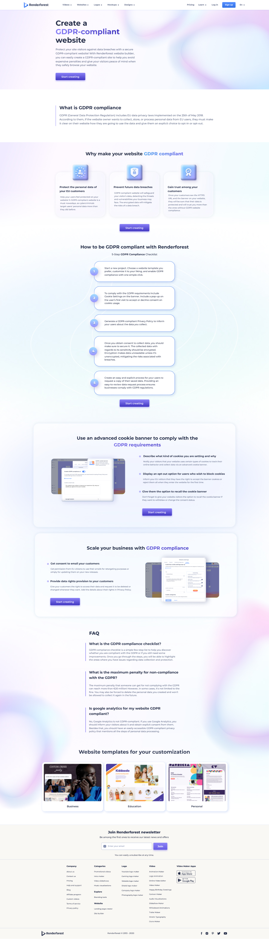
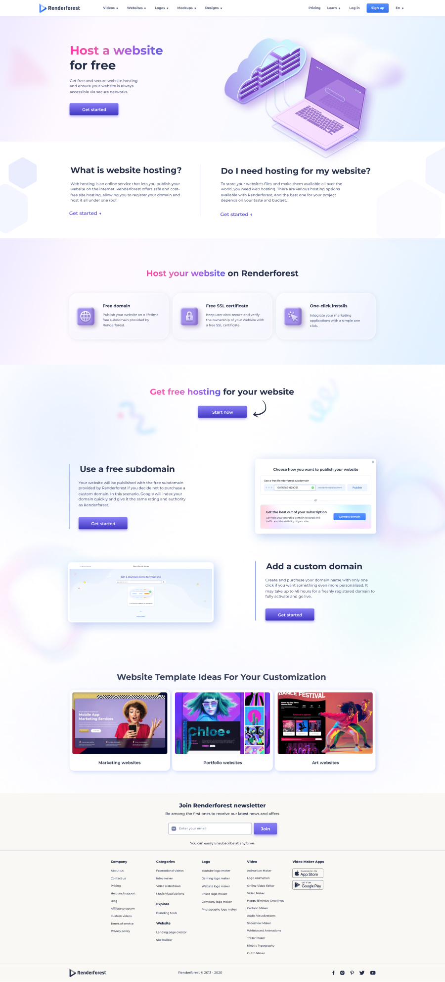
A dozen pages from the broader set — video makers, mockup generators, programs, and feature/infrastructure pages, all built on the same skeleton.
When typography is the product.
For a feature page selling a typography tool, the hero needed to be typography. Rather than leading with the usual 3D illustration, I led with a video preview where the typographic treatment was the star, paired with template thumbnails that showed off the range of type effects users could create. The page reads as both a marketing page and a small product demo — a quiet shift from the standard category page template, justified by the product's nature.
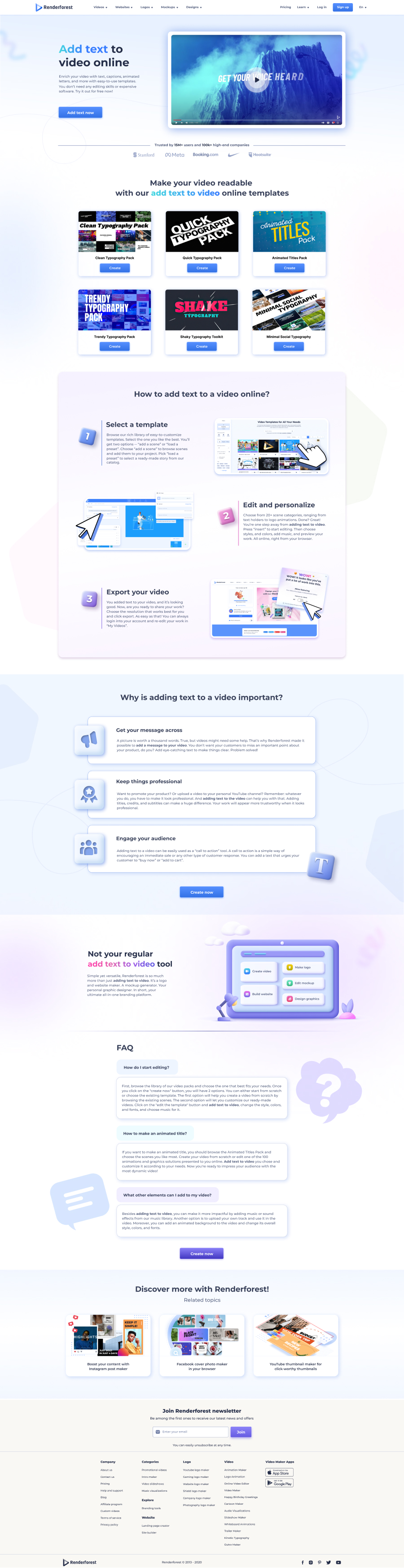
The Add text to video page — typography leading, illustration receding.
Breaking the palette on purpose.
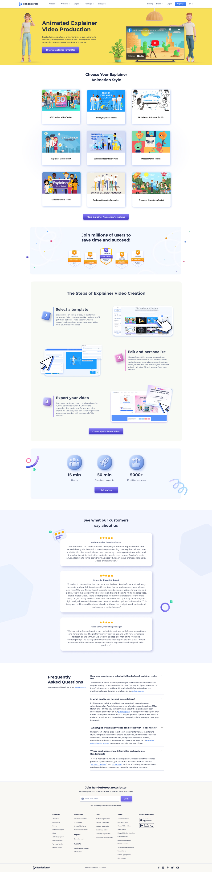
Most Renderforest landing pages live in soft pastels — purples, pinks, light blues. For the Animated Explainer page, I made a deliberate break: a bold yellow hero with character illustrations, far more saturated than anything elsewhere in the system.
The decision was strategic — explainer videos sell on energy and warmth, and a calm pastel hero would have undersold the product. The rest of the page (templates, how-it-works, FAQ) returned to the familiar layout, so the page still belonged to the family while making a louder first impression than its neighbors.
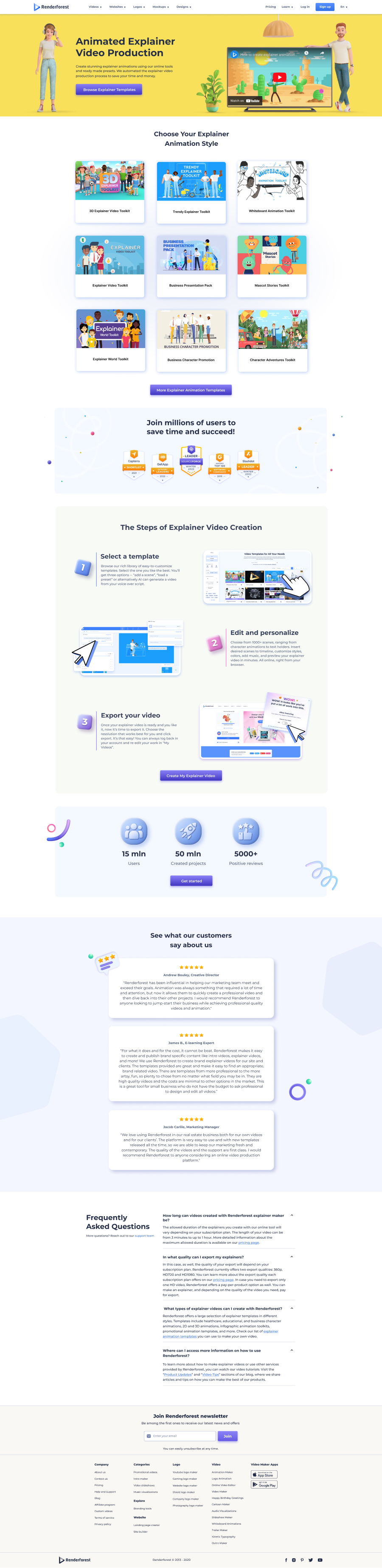
The Animated Explainer page — louder on first impression, familiar below the fold.
What I'd take from this work into any in-house design role.
The biggest lesson from Renderforest is that design systems and visual craft aren't in tension — they're in conversation. A good system removes friction from the boring decisions so you can spend your energy on the interesting ones. When I'm working inside a system, I'm not limited by it; I'm freed by it.
The second lesson is about speed at scale. Producing 30+ landing pages in 10 months without losing quality required a different muscle than I'd built in deeper product work. It's a muscle I now bring to any project where a small design team has to ship a lot.
Want to see specific decisions on any page, or talk through how I'd approach a similar challenge at your team? Happy to walk through the work.
Get in touch →Like what you see?
I'm open to senior product design roles and select freelance engagements. Always happy to chat.
Get in touch →