A spiritual jewelry brand, designed page by page.
Seasonal campaigns, editorial features, and brand storytelling pages for Karma and Luck — a meaning-led jewelry brand where every landing page had to feel intentional, sacred, and shoppable at the same time.
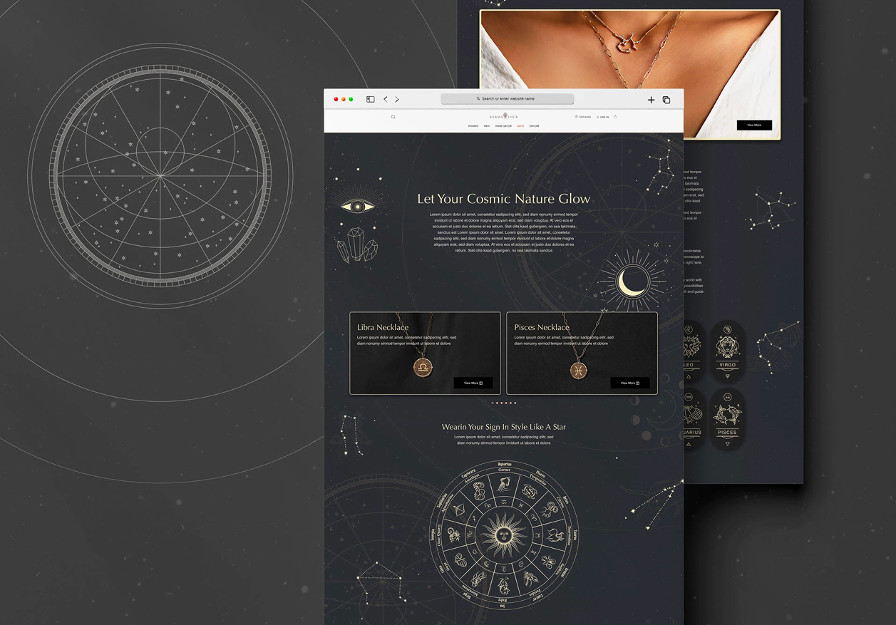
A jewelry brand that sells meaning, not just metal.
Karma and Luck doesn't sell jewelry the way most jewelry brands do. Every piece is anchored in symbolism — zodiac signs, evil-eye protection, healing stones, intention-setting rituals. The brand lives or dies by whether the storytelling lands.
That made the marketing pages unusually hard. A standard product grid would have flattened the whole proposition. Each campaign — a Valentine's gift guide, a Mother's Day edit, a zodiac feature, a charity page — needed its own tone, its own world, while still feeling part of one warm, mystical brand.
The job wasn't to design pretty pages. It was to translate a meaning-led brand into a dozen distinct moments — without the brand quietly diluting along the way.
Web designer for marketing and editorial pages.
I designed landing pages end to end — from the campaign brief, through composition and visual direction, to handoff. Day to day that meant:
- Translating seasonal and editorial briefs into single-page narratives — hero, story, products, social proof, CTA.
- Choosing the right mood per page — when to go dark and cosmic, when to stay warm and editorial, when to lean into seasonal motifs.
- Working inside the brand's symbolic visual language — zodiac wheels, hamsa hands, evil-eye motifs, hand-illustrated decorations.
- Composing for the Shopify-based stack and handing pages off to the development team for production.
One brand, many moods.
The shared bones across pages were familiar — hero with story, featured products, an editorial block, social proof (Vogue, GQ, Forbes), and a footer rich with brand iconography. The interesting work was in the tone each page took on.
Dark for the sacred. The Zodiac landing page went fully dark — black background, constellation maps, gold linework — because the subject deserved gravity. Cosmic content asks for a quiet, considered space; a beige page would have made it feel like a sale.
Warm and editorial for the seasonal pages. Mother's Day, Valentine's, Christmas, St. Patrick's — these leaned into the brand's softer side: hand-drawn florals, blush and gold palettes, countdown timers, illustrated characters. The point was to feel like a gift, not like an ad.
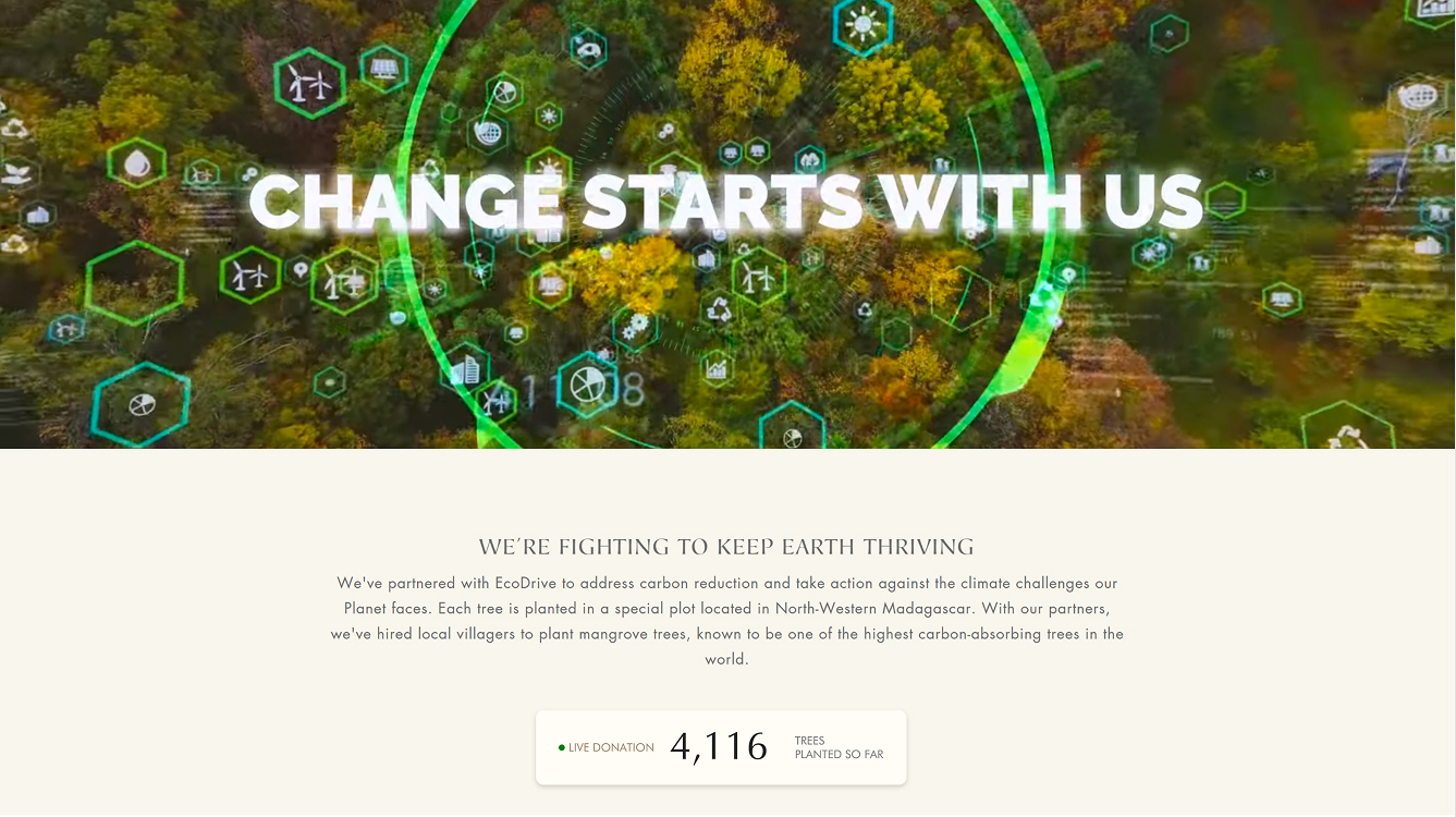
Documentary for the brand story. Pages like Charity & Giving Back and Career used real photography over decoration. The brand's mystical surface drops away to show the people and the work behind it.
Going dark, on purpose.
The Zodiac page is the clearest expression of the brand at its most considered. Pearl-on-black typography, a constellation backdrop, a central zodiac wheel as the navigation device, and the twelve signs rendered as quiet medallions at the foot of the page.
Almost every other Karma and Luck surface is warm and pale — so going this dark was a deliberate departure. The decision held because the content earned it: this isn't a product page, it's a moment of orientation. The page asks the visitor to look up, find their sign, and then enter the store from there.
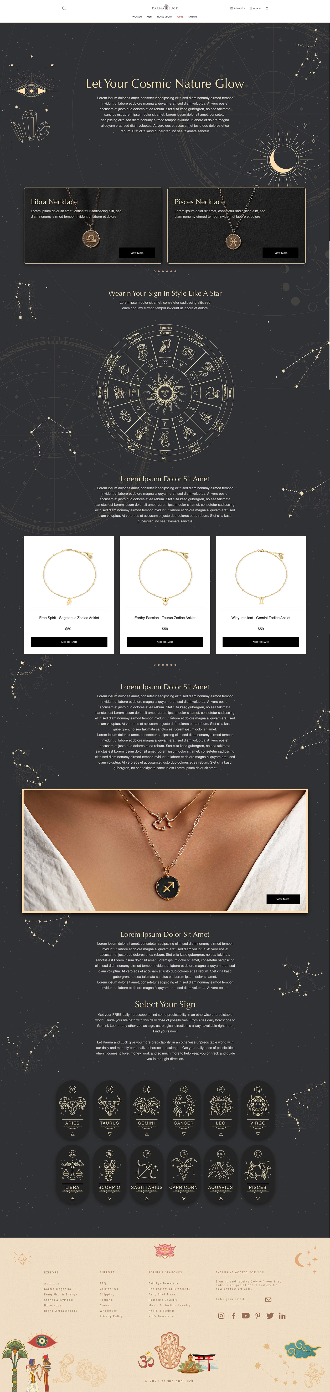
The Zodiac landing — dark, quiet, and confident in its departure from the rest of the brand surface.
The countdown moment.
Sale countdowns are their own little design problem: a hero, a discount, a code, a ticking clock, and a coherent seasonal mood — all in the height of one screen. I designed a recurring banner format and re-skinned it for every campaign on the calendar, so the page felt like the holiday without losing the brand.
Same skeleton each time — illustrated frame on the left, copy block in the middle, days/hours/minutes/seconds clock — varied by motif, palette, and tone. The Valentine's banner pushed it furthest with animated heart confetti.
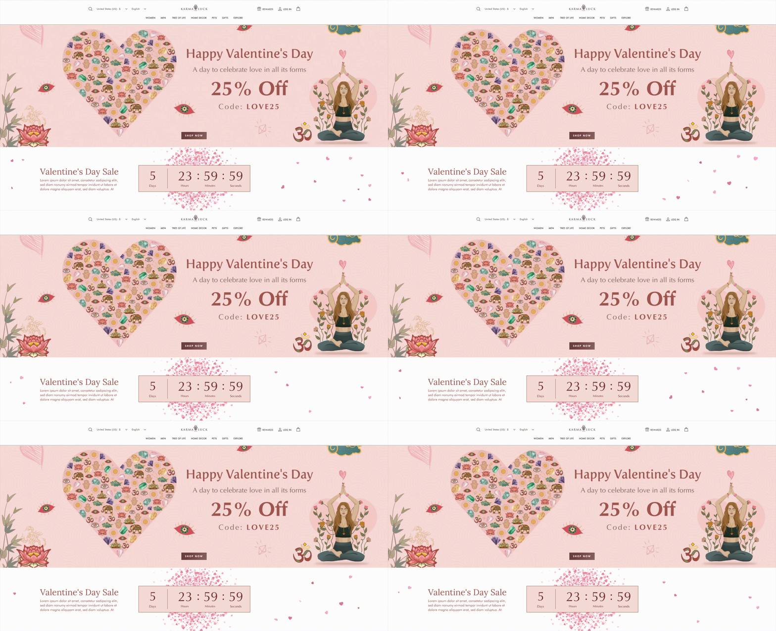
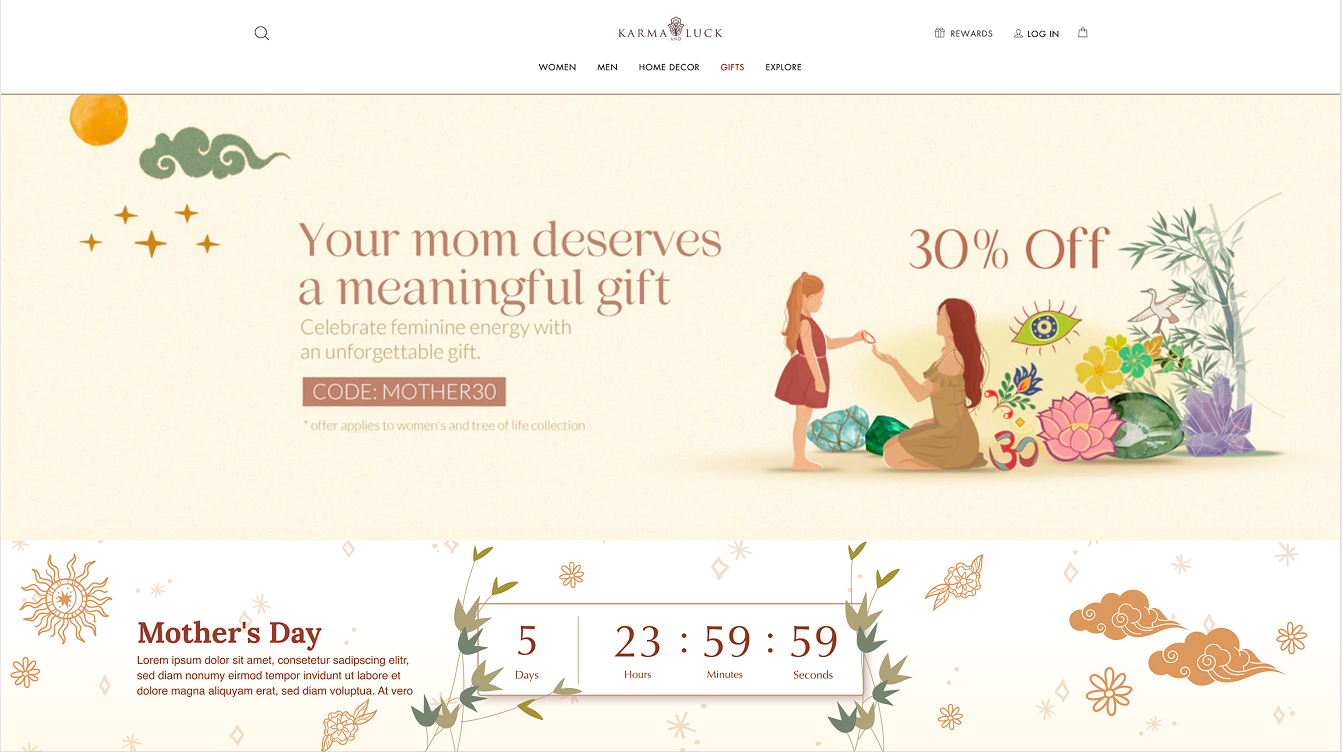
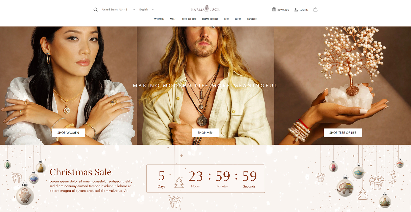
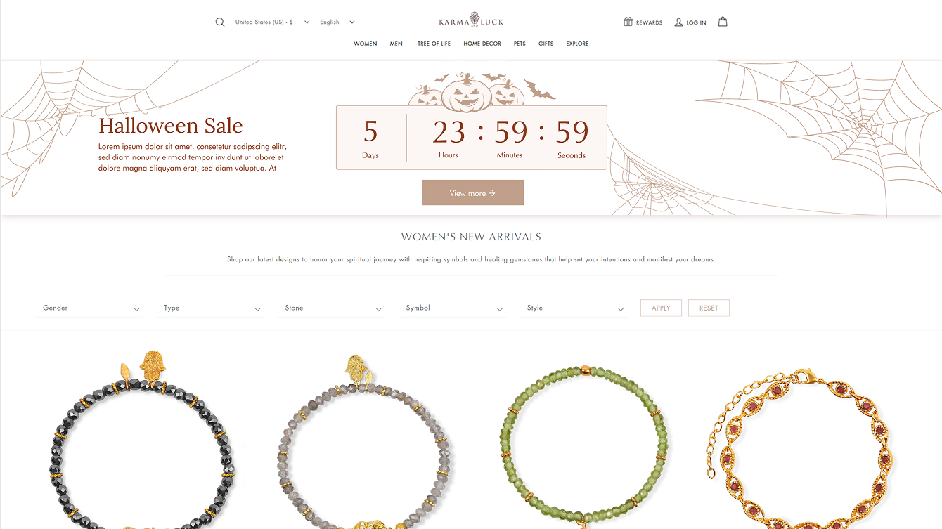
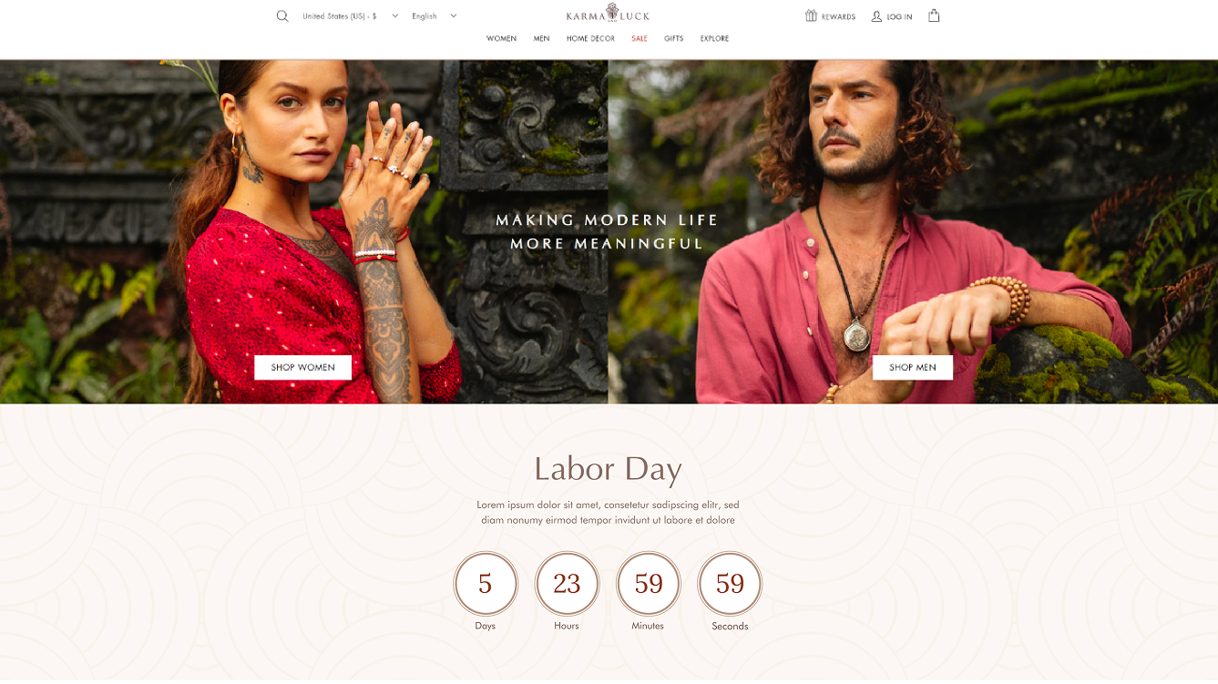
One countdown format, six campaigns. The Valentine's banner is the only one with animation — kept restrained so it pulls attention without performing.
The rest of the year.
A dozen other pages across seasonal campaigns, editorial features, and brand storytelling. Shown small here — they're working production pages, not portfolio screenshots, and the source captures are lower resolution.
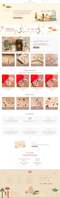
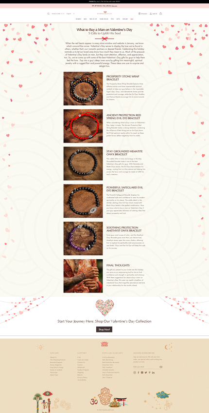
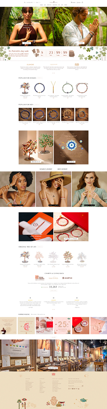
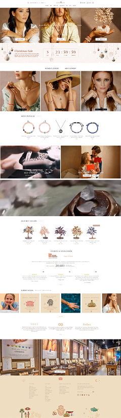
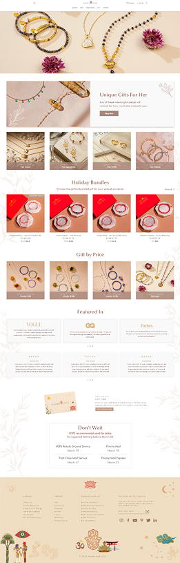
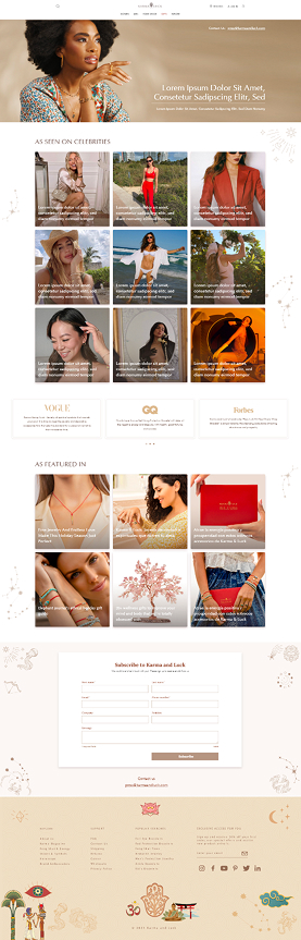
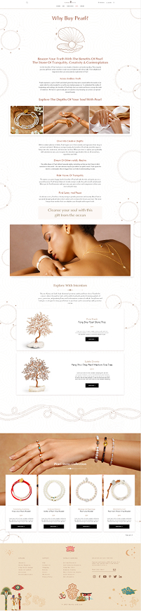
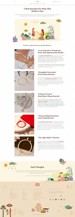
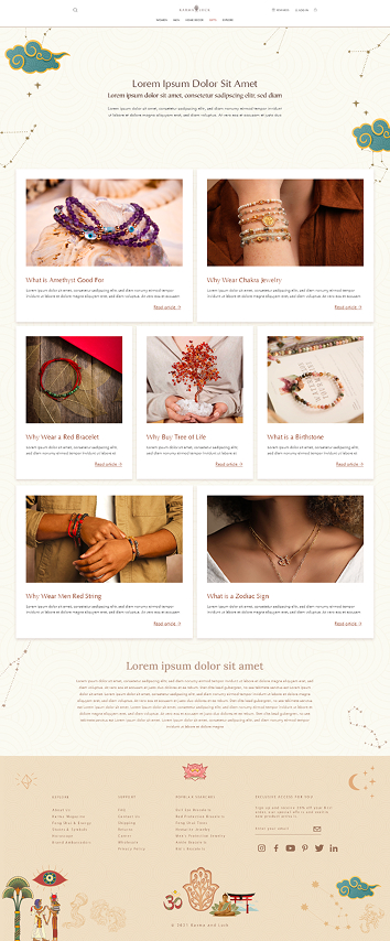
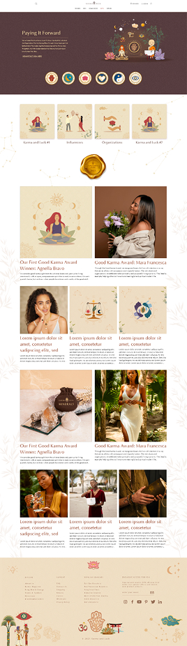
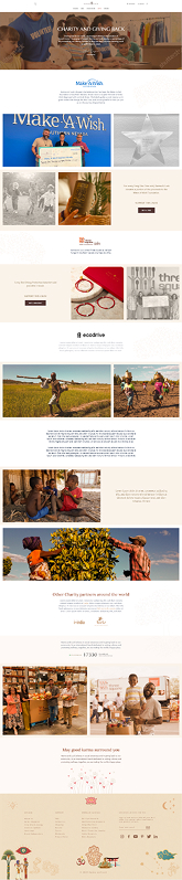
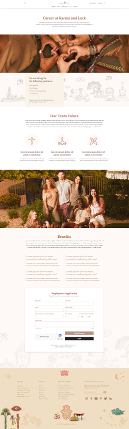
Twelve more pages across seasonal, editorial, and brand storytelling — same family, different rooms.
Designing for a brand that sells meaning.
The biggest lesson from Karma and Luck is how much restraint matters when a brand's whole proposition is symbolic. With this much visual vocabulary available — zodiac signs, hamsas, evil eyes, constellations, healing stones — the temptation to decorate every surface is constant. The pages that worked best were the ones that chose: one motif, one mood, one job.
The other lesson was about register. A jewelry brand built on intention can't talk like a fast-fashion brand. The copy, the spacing, the color, the imagery all had to feel slower and more considered than a typical e-commerce surface — without becoming precious or losing the call to shop.
Want to see specific decisions on any page, or talk through how I'd approach a similar brand at your team? Happy to walk through the work.
Get in touch →Like what you see?
I'm open to senior product design roles and select freelance engagements. Always happy to chat.
Get in touch →