A pricing calculator
that turns a sign into a ticket.
Frontsigns is a US signage company. Its staff quote custom signs every day: channel letters, marquee letters, mesh banners, street signs. Each one has its own sizes, materials, faces, lighting and installation. I designed the internal calculator they use to configure a sign, see an itemized price build up as they go, and send the finished quote as a ticket.

Every sign is a different product with its own price.
A single order rarely means a single sign. A storefront job can combine channel letters for the facade, a logo cabinet, a mesh banner for the opening and installation on top. Each product prices differently: channel letters by letter height and type, banners by width × height plus grommets, marquee letters by face, paint colors, vinyl and LEDs.
The calculator had to hold all of that in one place. A worker needed to build up a multi-product order, see what each choice costs, and send a clean, itemized ticket to the next team without retyping anything.
Line items → products → elements.
The model behind the screen is a three-level hierarchy, and the layout follows it:
- Line item: a named piece of the order, such as "Main facade" or "Opening banner". An order can hold several.
- Product: what's being made inside that line item: Channel Letters, Mesh Banner, Street Signs and more. A line item can hold several products.
- Elements: the repeatable parts of a product, such as text rows, logos, printing panels and banners. Each row can be duplicated or deleted on its own.
The summary on the right mirrors the same hierarchy. Every option the worker picks on the left shows up on the right with its own line and price, so there's never a mystery number in the total.
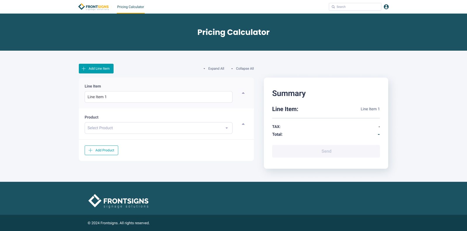
The starting state: one line item, one empty product, and a summary that stays empty until there's something to price. Send stays disabled until then.
A grouped, searchable product picker.
The catalog is long, and workers think in families first, so the product field opens as a searchable list grouped by category (Channel Letter, Free-standing Signs and so on). Once a product is chosen, the field shows it as a path, for example Channel Letters / Marquee Letters, so the parent category stays visible without opening the list again.


Left: the grouped picker with search. Right: the same product collapsed. The form folds away, but the summary keeps the full breakdown.
Visual type tiles, then only the fields that product needs.
Letter types are easy to confuse by name alone, so channel-letter types are picked from image tiles: Injection Molded, Formed Plastic, Cut Plastic, Changeable, Aluminum, Marquee, Cast Metal, Cut Metal, Laminated, Fabricated Metal and Cast & Etched Plaques. Each tile shows a sample "G", so the worker matches what the customer described to what the shop actually makes.
Below the tiles, the form changes with the product. Marquee letters ask for height, face (e.g. bulbs), paintable colors, regular or perforated vinyl, an optional raceway bar and LED. A mesh banner only needs height, width and grommets. A street sign combines channel letters, a logo and printing. Workers never see fields that don't apply.

Two marquee products in one line item: text rows with a curved-font option, a logo with artwork upload, and the summary listing each product's options and prices.
A live summary, with room for judgment.
The summary is the part workers actually read. Each product gets its own block, with every option on its own row: type, size, face, paint, vinyl, text, logo and installation. The price sits on the right, and tax and total are at the bottom. Attached artwork shows up as file chips, so whoever picks up the ticket gets the files with it.
Calculated prices don't cover every case, so each product also has a Custom Price field. A worker can override the number when a job needs it without breaking the rest of the quote.
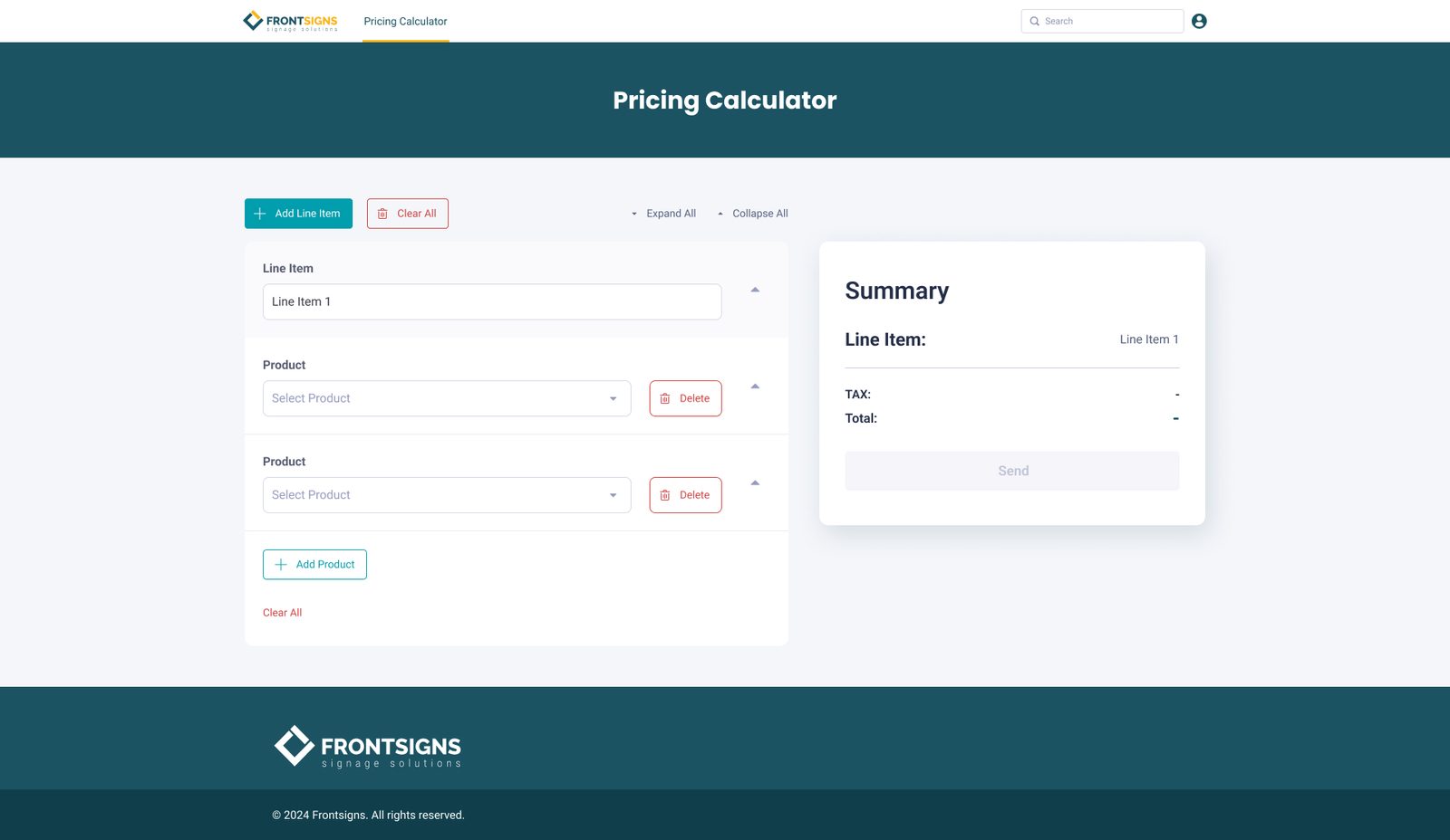
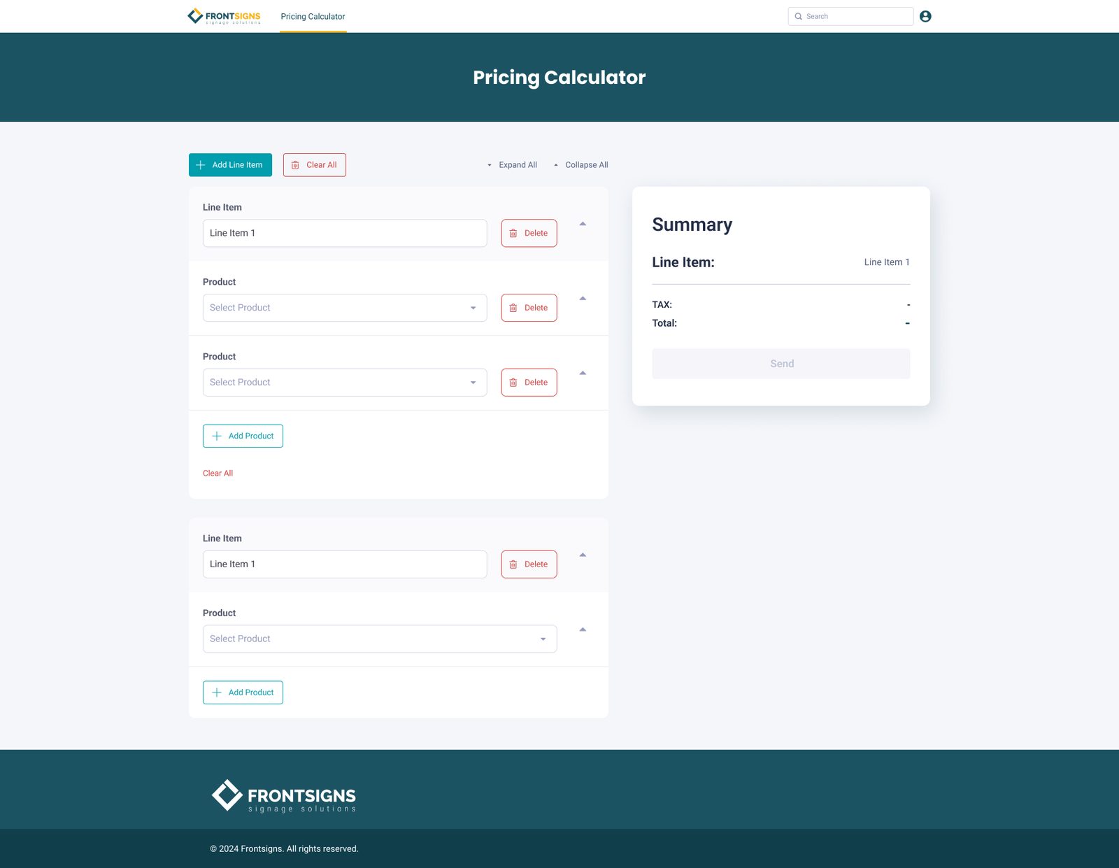
Building up an order: several products in a line item, several line items in an order. Expand All and Collapse All keep long quotes manageable.
Getting the hierarchy right took a few rounds.
Earlier versions put the line item in its own card above the products, with products as separate cards below. Each product also had its own nested Clear All. It worked, but the structure was hard to read: it wasn't obvious which product belonged to which line item, and long orders became a wall of cards.
The final version puts each line item and its products in one container, with collapse controls at every level and a single place to add or clear products. The type field also changed from a dropdown to the image tiles. That was a small change, but it removed a common source of wrong quotes.


Earlier iterations: line item and products as separate cards (left), and the Street Signs product combining letters, logo and printing (right).
Internal tools still need design.
The people using this aren't customers. They're staff quoting jobs all day, and every confusing field turns into a phone call or a wrong price. Most of the design work here was making a complicated pricing model easy to follow. The structure on the left matches the structure on the right, people pick from pictures where names are ambiguous, and every number in the total can be traced back to an option.
Happy to walk through the pricing logic and the edge cases in more detail.
Get in touch →Like what you see?
I'm open to senior product design roles and select freelance engagements. Always happy to chat.
Get in touch →