Building the EasyDMARC design system.
Designing the foundations — color and typography systems — and a fourteen-component library for EasyDMARC's design system. Built from scratch alongside another designer on the team, and live in the product today.
Scaling a security platform needs a system, not screens.
EasyDMARC is an email security platform — a multi-product suite covering DMARC, SPF, and DKIM authentication, deliverability, and reputation monitoring. As the product surface grew, designing one screen at a time was no longer viable. The team needed a real design system: a set of foundations and components every product surface could be built from, so the platform would feel like one product rather than a stack of features.
I worked on the system alongside another designer on the team. My contribution was the foundations — the color system and the typography system — plus fourteen components in the component library. The other designer contributed other components to the broader system.
The brief: build the parts of the system that everything else would have to rest on — color and type — and design a substantial set of components on top, with both web and in-product surfaces in mind.
The foundations, plus fourteen components.
- Color system — source palette, full color tokens (primary, neutral, semantic), and the palette layer that sits between them.
- Typography system — type scales for both web and app contexts, the token layer that defines them, and the component-level typography list that maps the system into UI components.
- Components — fourteen designed end-to-end: buttons, links, breadcrumbs, tabs, content switchers, steppers, modals, drawers, popovers, tooltips, message boxes, notifications, tags, and status indicators.
Other components in the broader EasyDMARC design system were contributed by the other designer on the team. The system as a whole is live in EasyDMARC's product today.
A three-layer color system: source, palette, tokens.
The color system is structured in three layers. Source colors are the raw inputs — every hue the brand can use. The palette is the curated working set — the colors actually approved for product UI. Tokens are the named, semantic references used in components and screens — what designers and engineers actually reach for in practice.
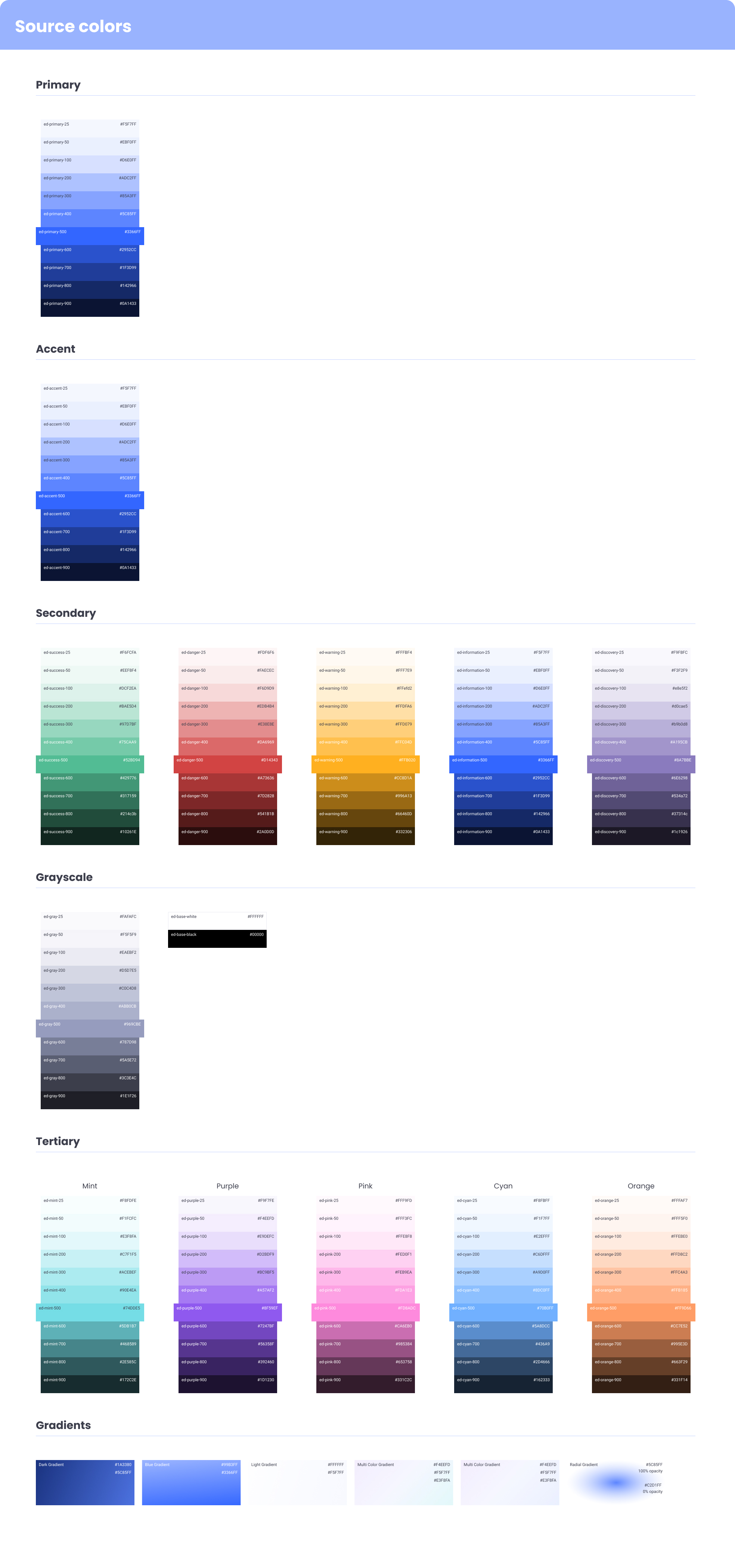
Source colors — the full hue range the brand can draw from.
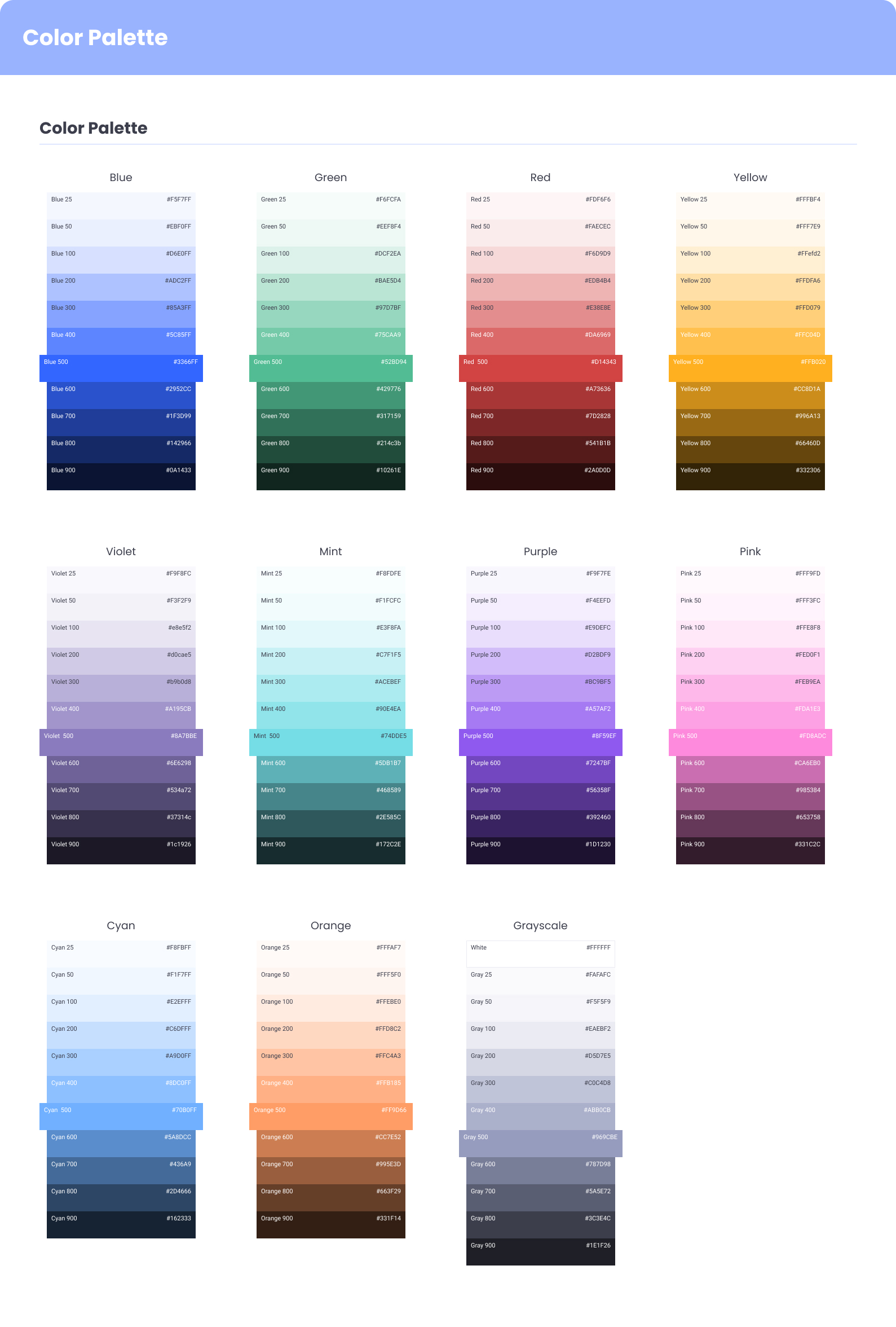
The palette — the curated working set, approved for product use.

Color tokens — semantic names, hex values, and usage that components and screens actually reference.
One type system, two contexts.
EasyDMARC is both a web product (marketing, dashboards) and a denser in-app product (analytics, configuration). The typography system has to work in both — the scale on the marketing site can be more generous, while the in-app scale needs to be tighter and more information-dense. The system defines both, with shared tokens underneath so they stay coherent.
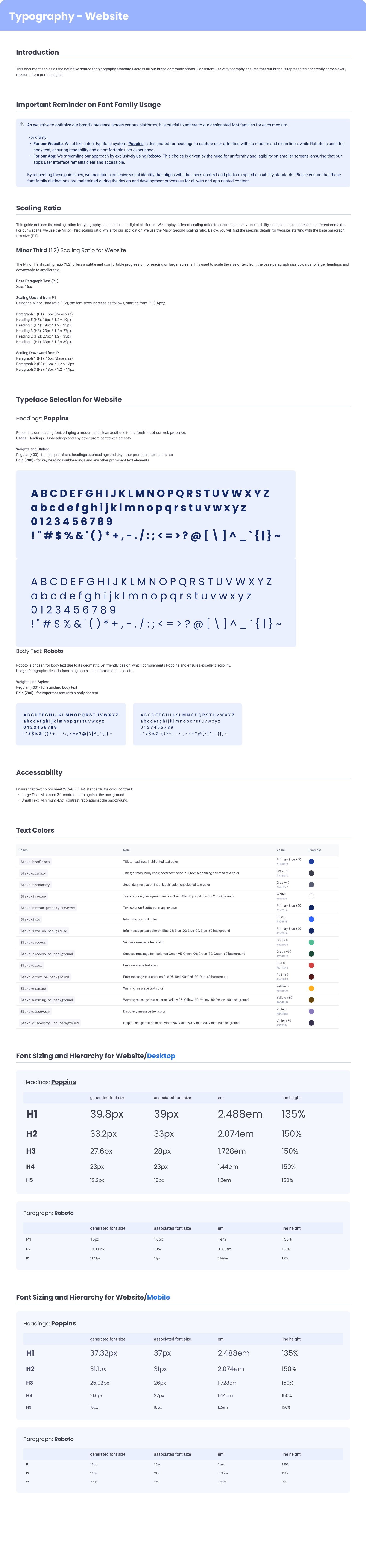
Web typography — display through caption, with the scale generous enough for marketing and dashboards.
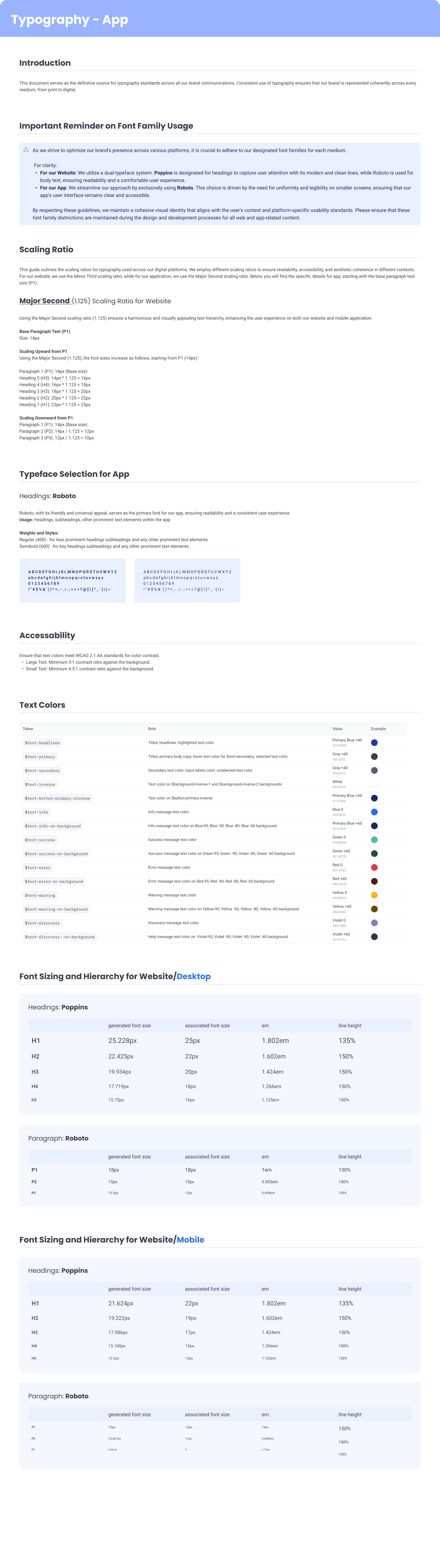
App typography — tighter and denser for in-product analytics and configuration.
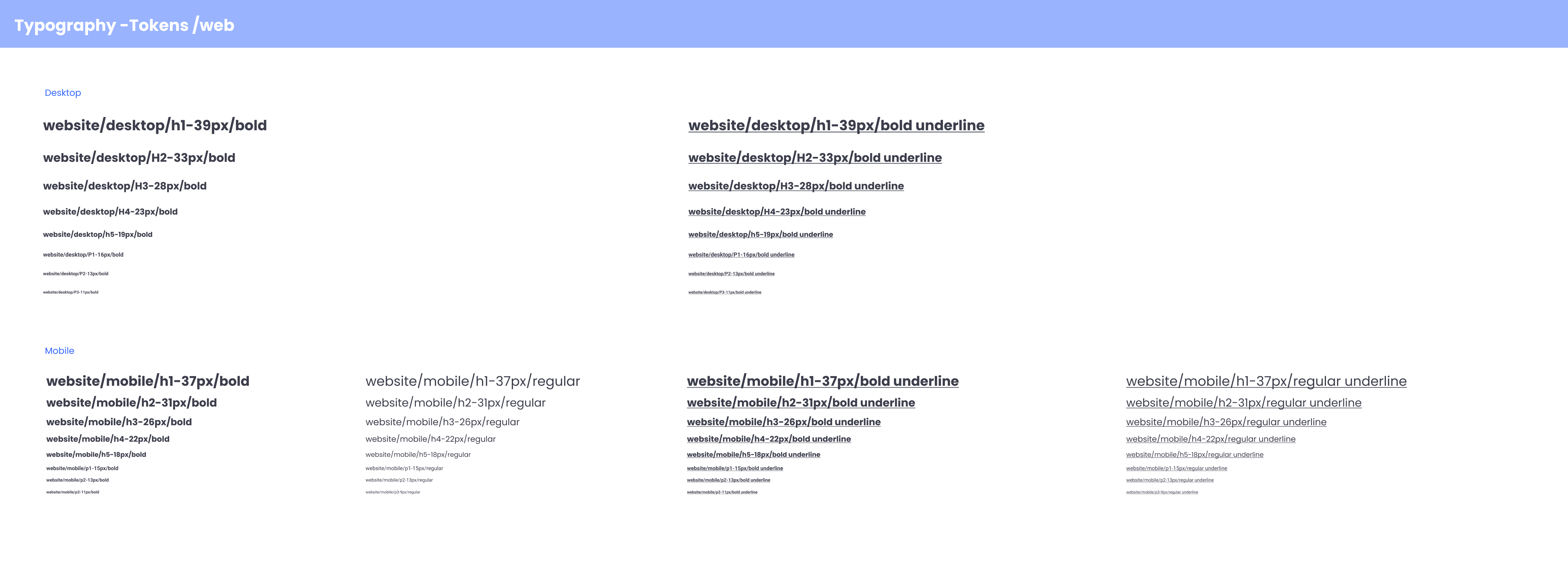
Web typography tokens — the named layer between the raw scale and the components.
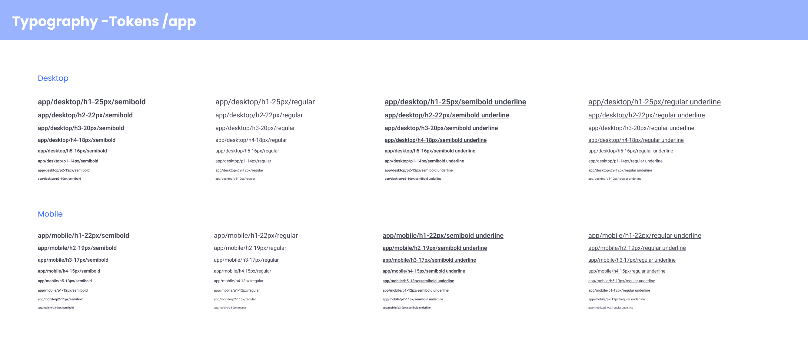
Typography mapped into components — which token each UI component uses, so behavior stays consistent across the system.
Fourteen components, designed end-to-end.
Each component covers its full set of states, variants, and content combinations. The goal was that engineering could implement directly from the spec, and other designers could compose screens without re-inventing patterns.
Buttons
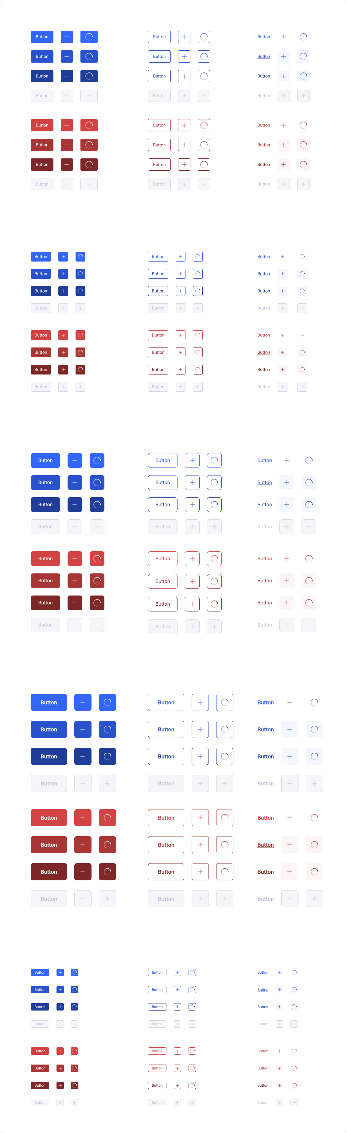
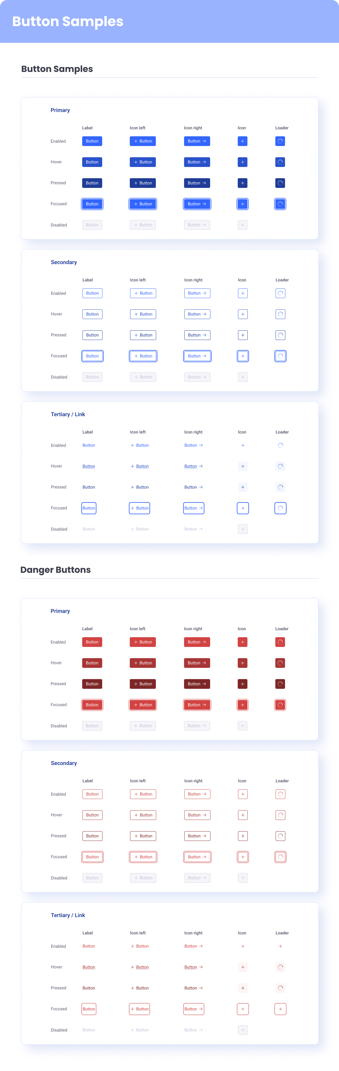
Buttons — variants, sizes, and full state coverage.
Links & Breadcrumbs
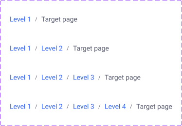
Inline navigation — breadcrumbs.
Tabs & Content switchers
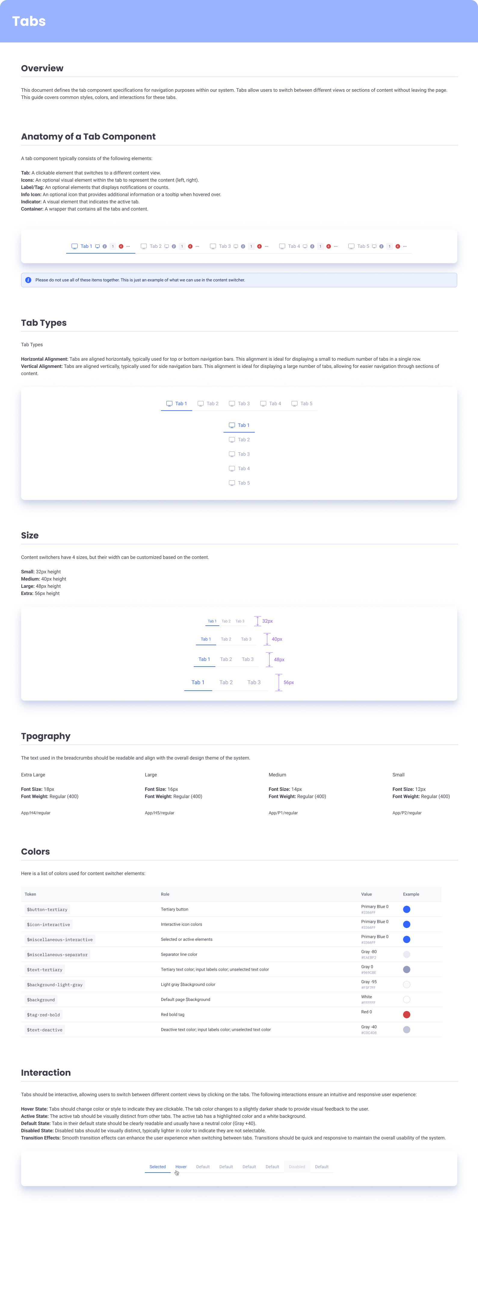
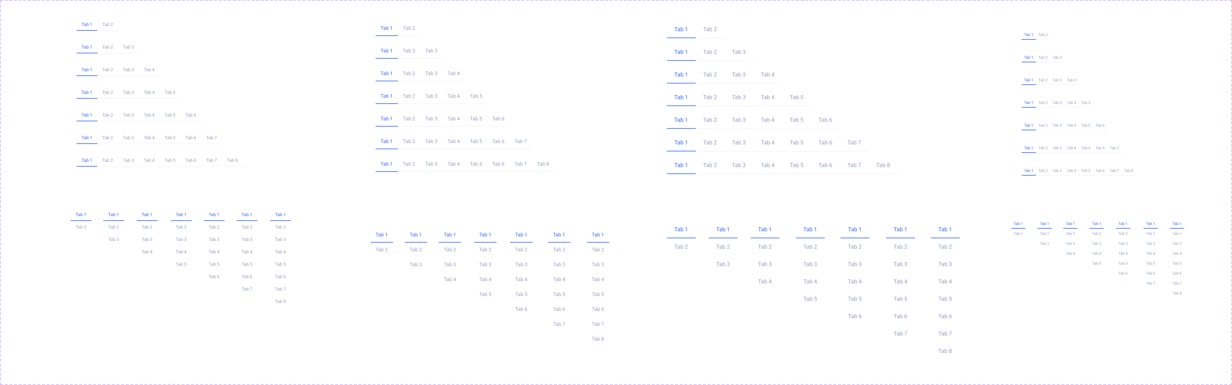
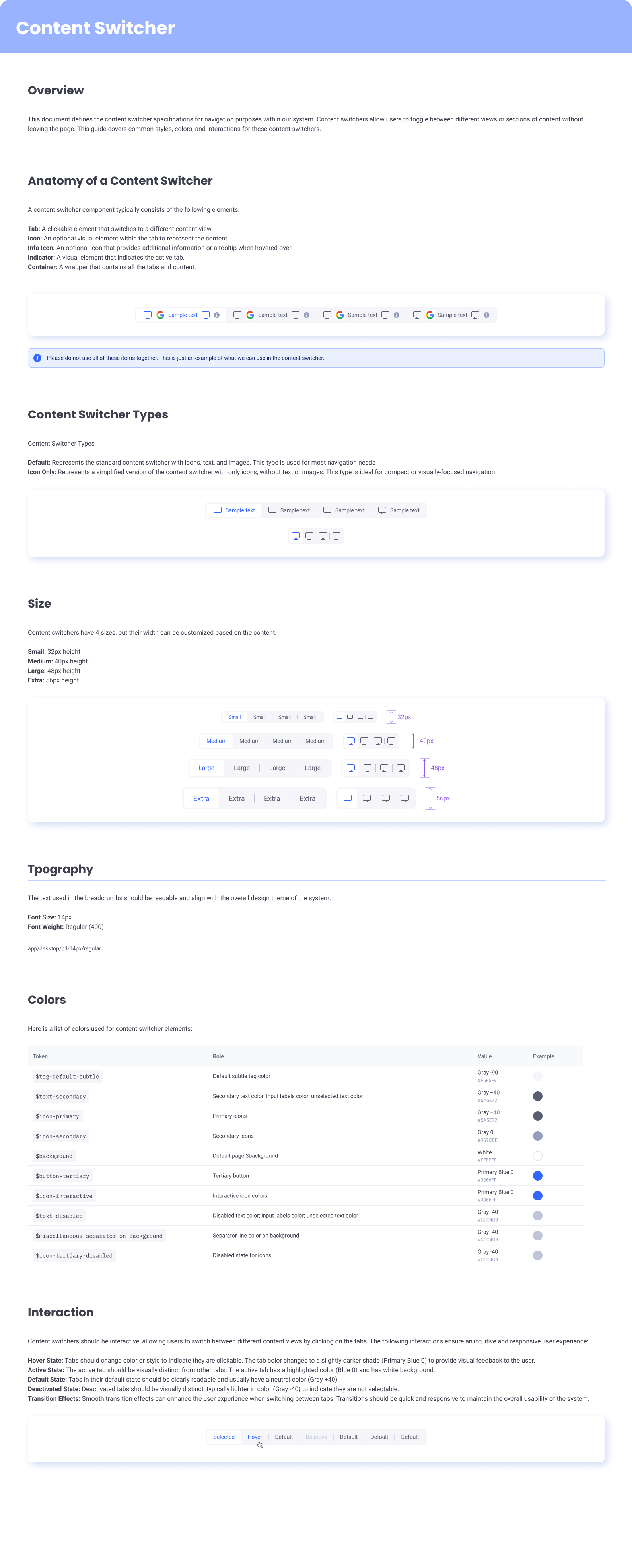
Sectional navigation — tabs for layered views and content switchers for compact toggles.
Stepper
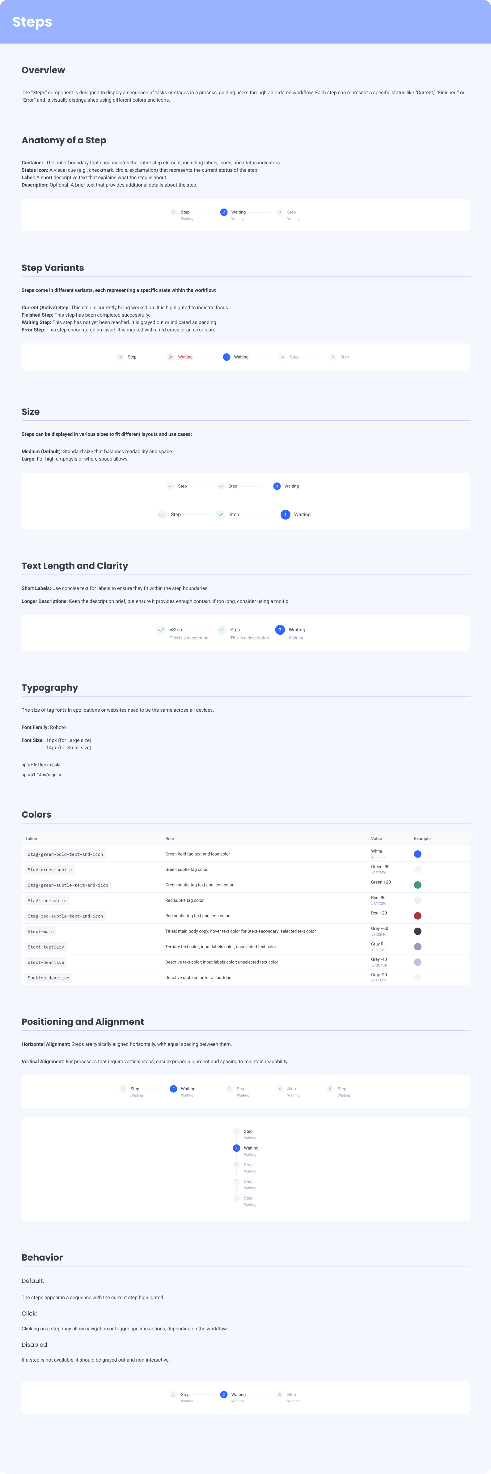
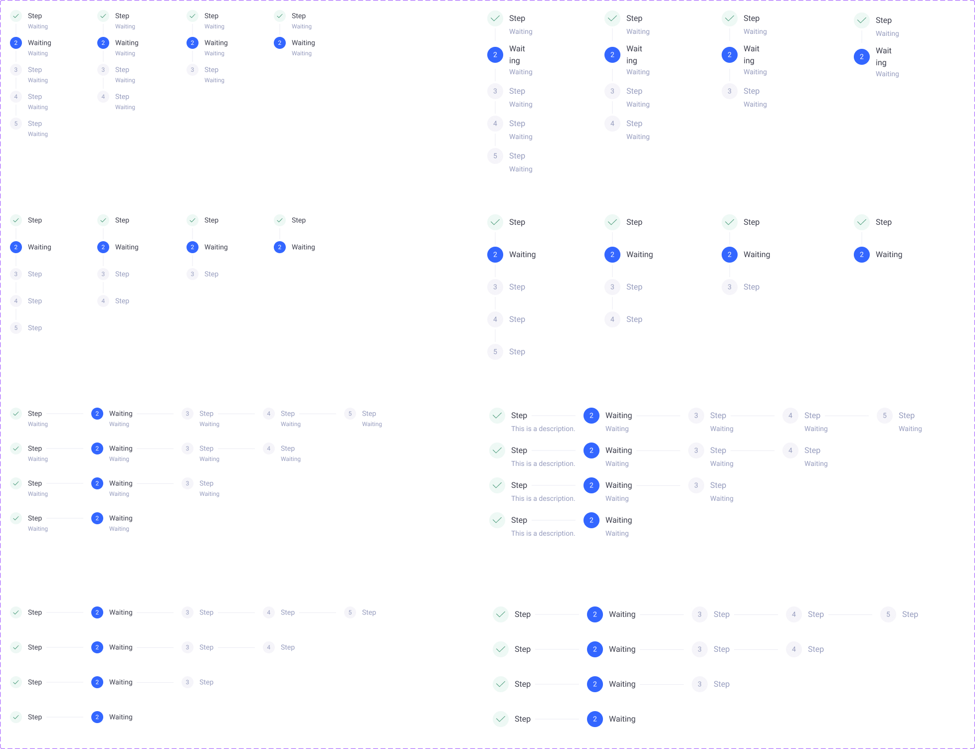
Stepper — for multi-step setup, onboarding, and guided configuration.
Modal patterns
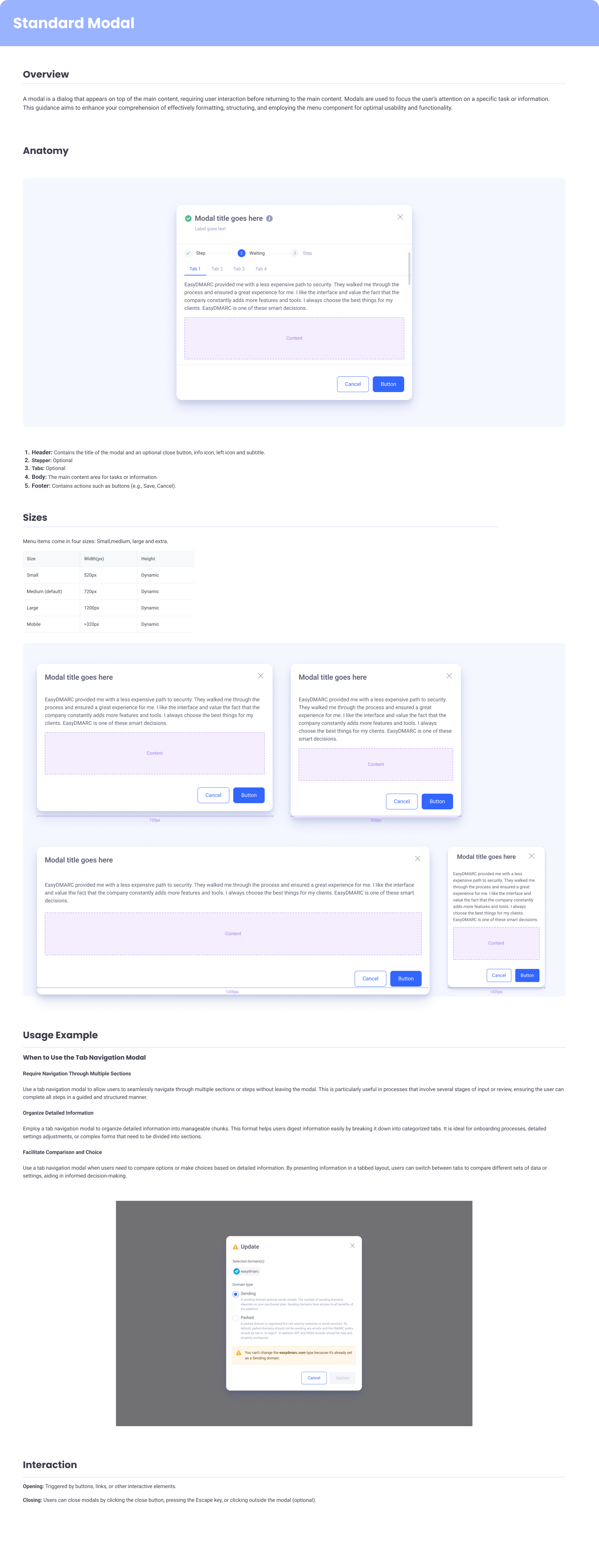
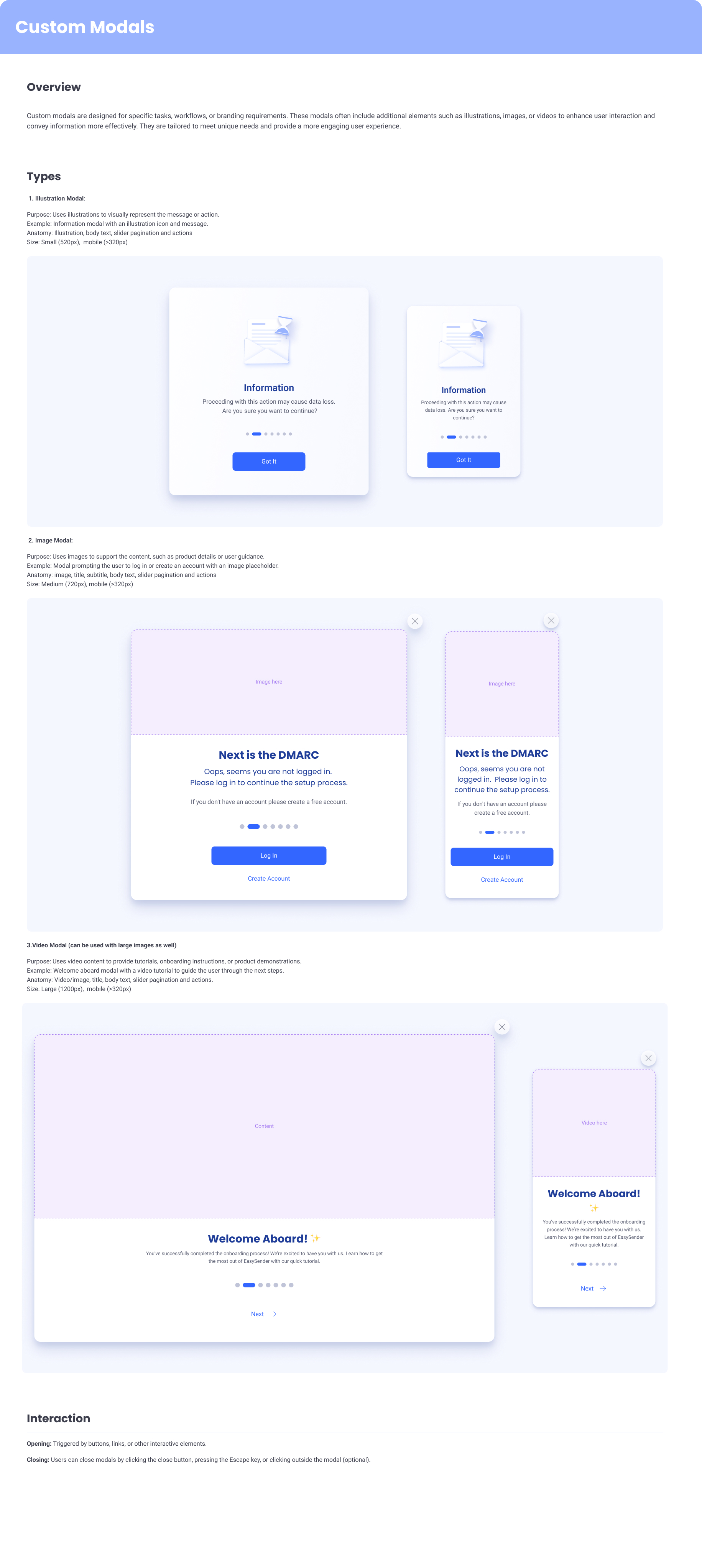
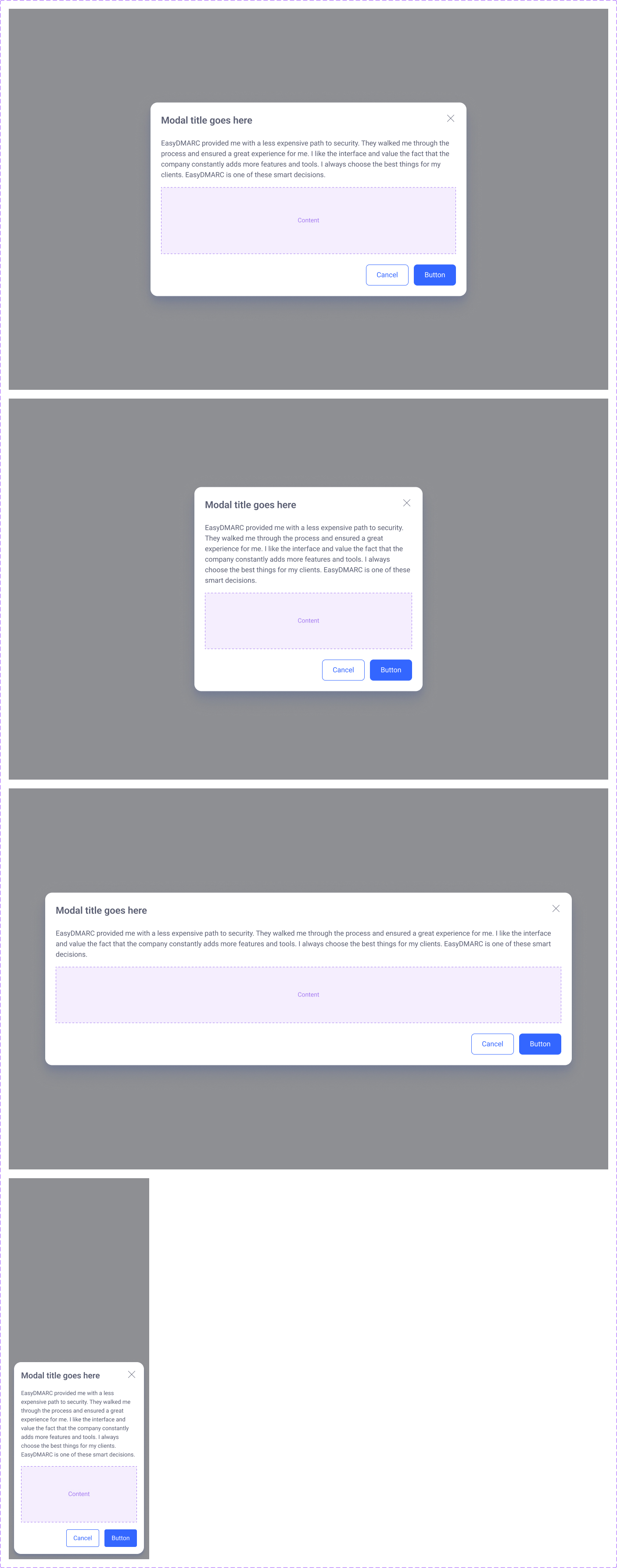
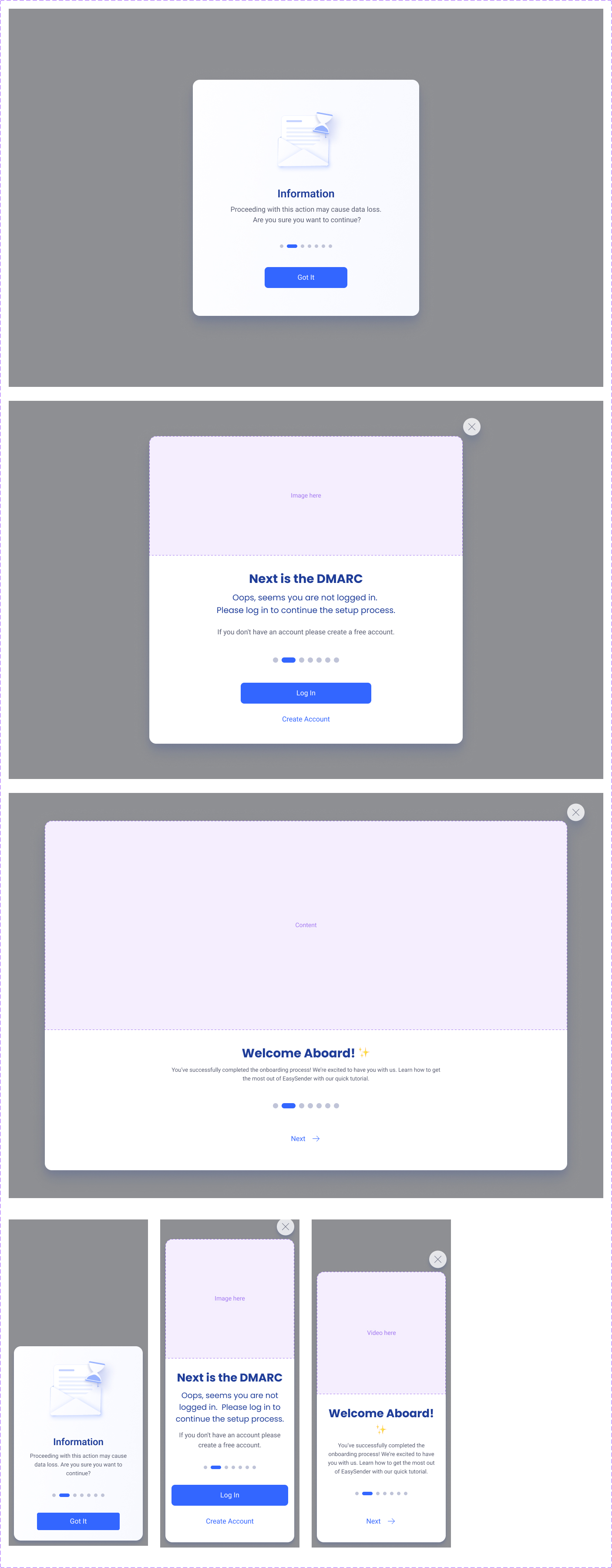
Modals — base pattern plus custom variants for the flows where the base wasn't enough.
Drawers, Popovers & Tooltips
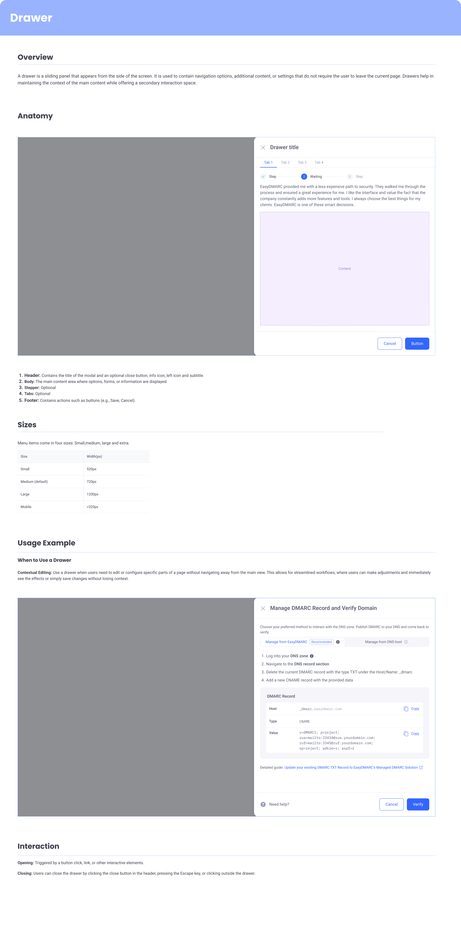
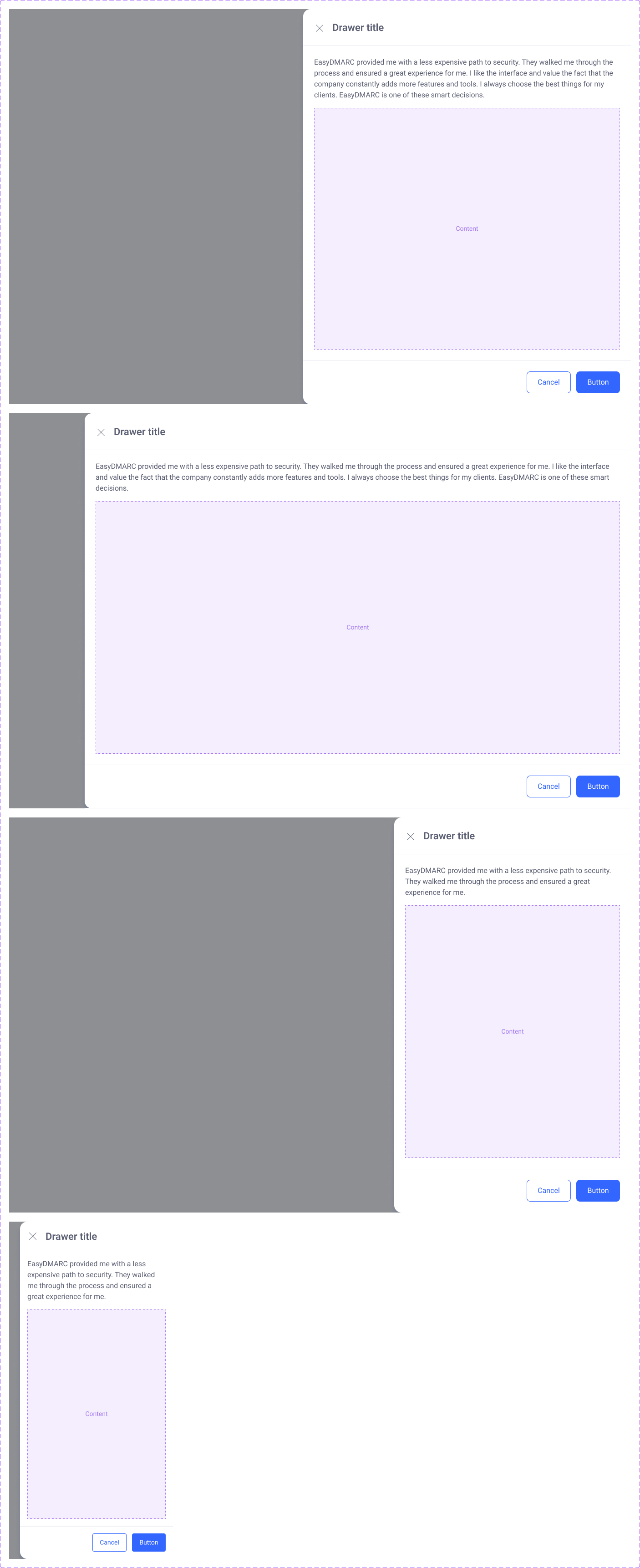

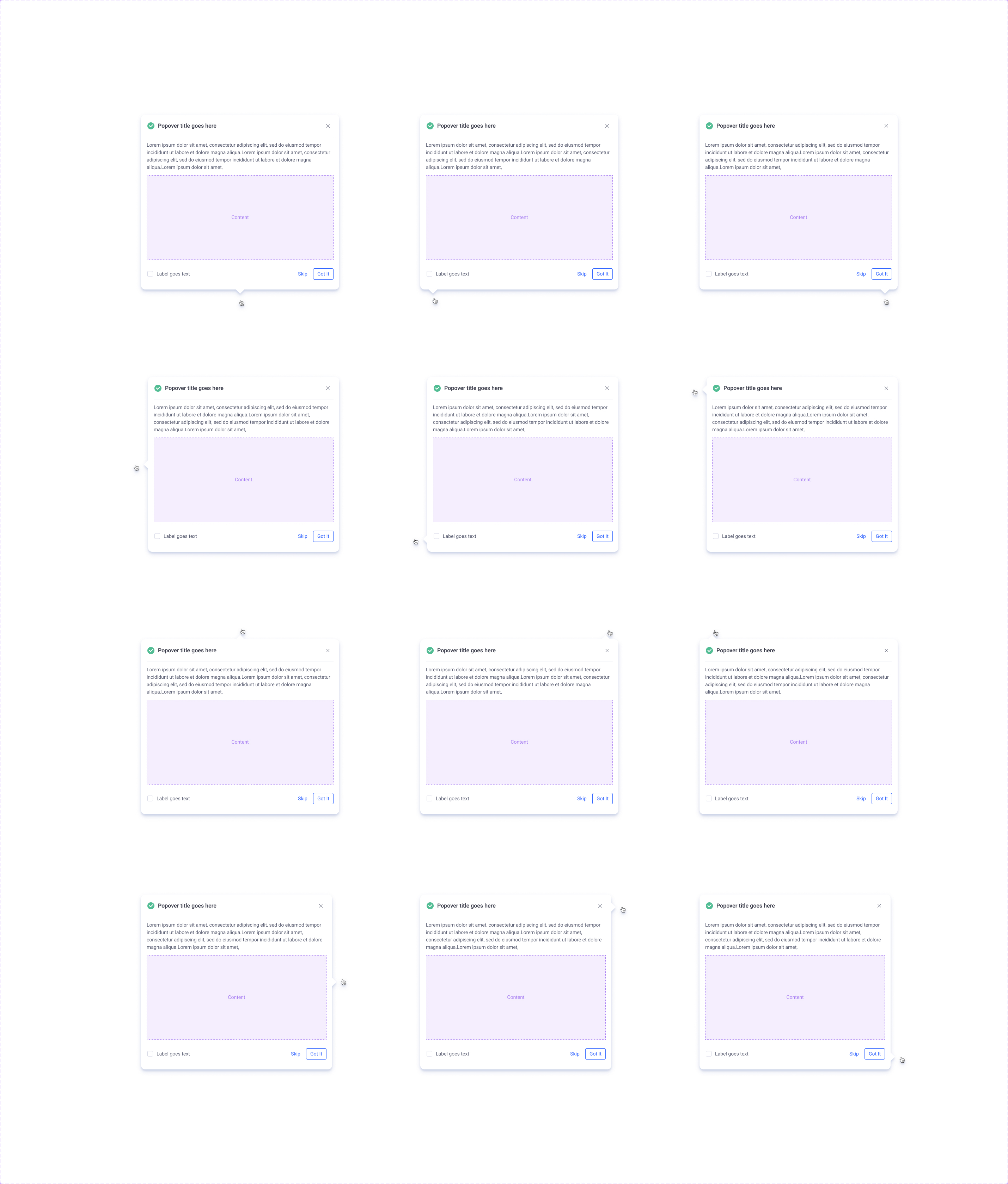
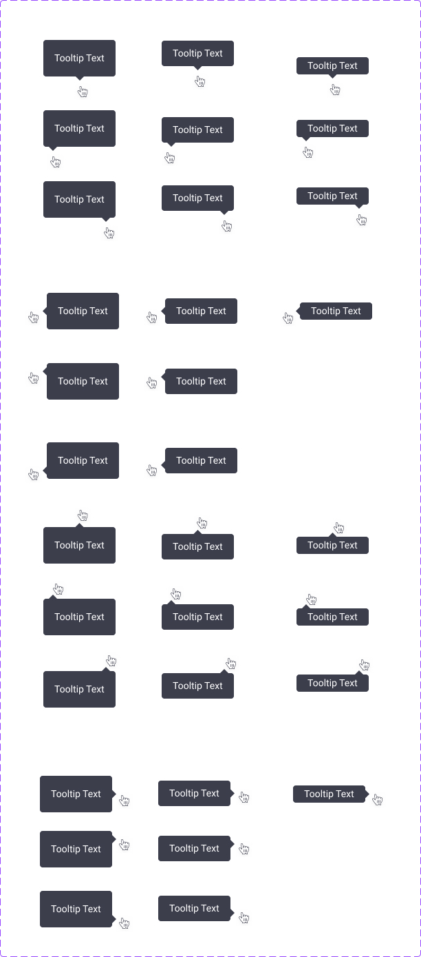
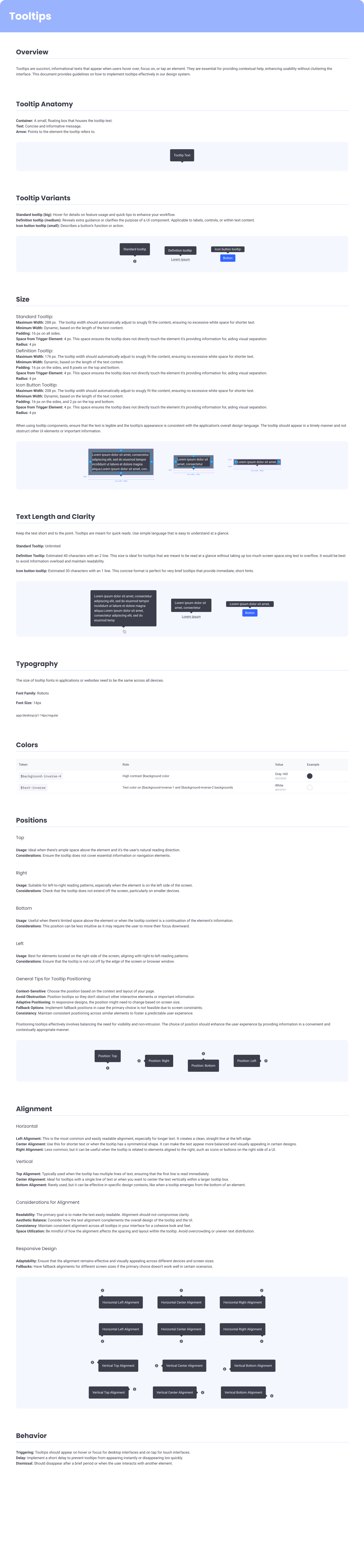
Overlay patterns — drawers for tasks, popovers for context, tooltips for hints. Three placements, one consistent vocabulary.
Message boxes
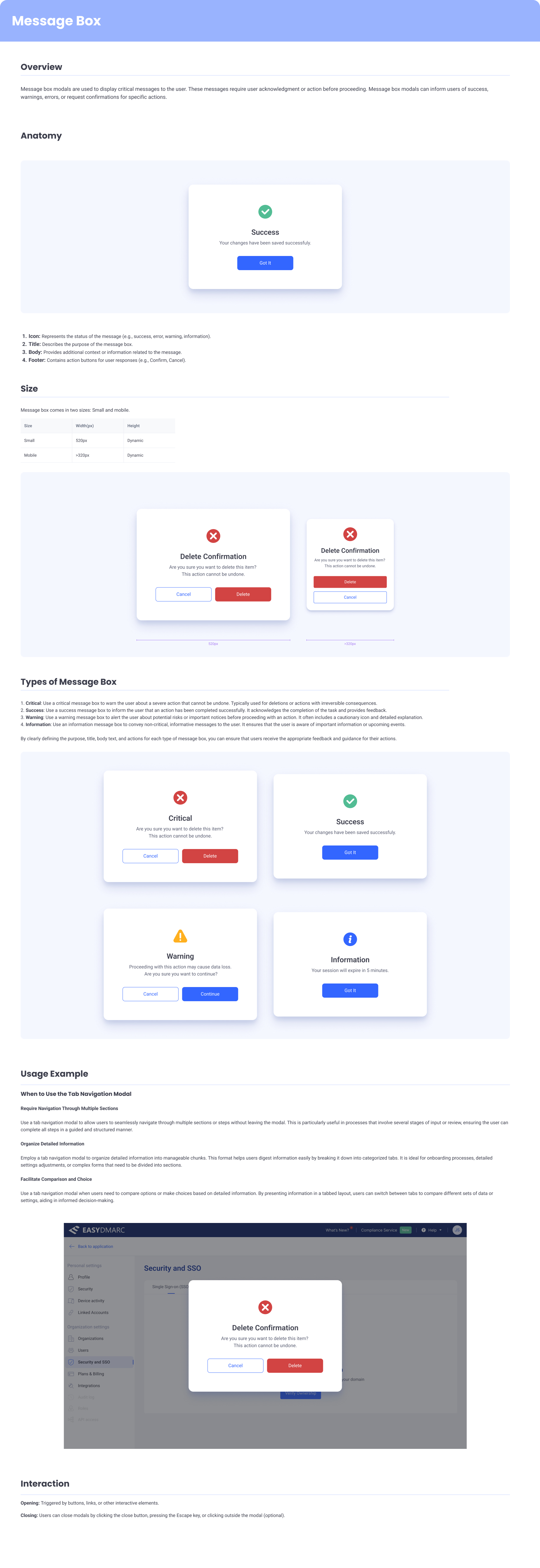
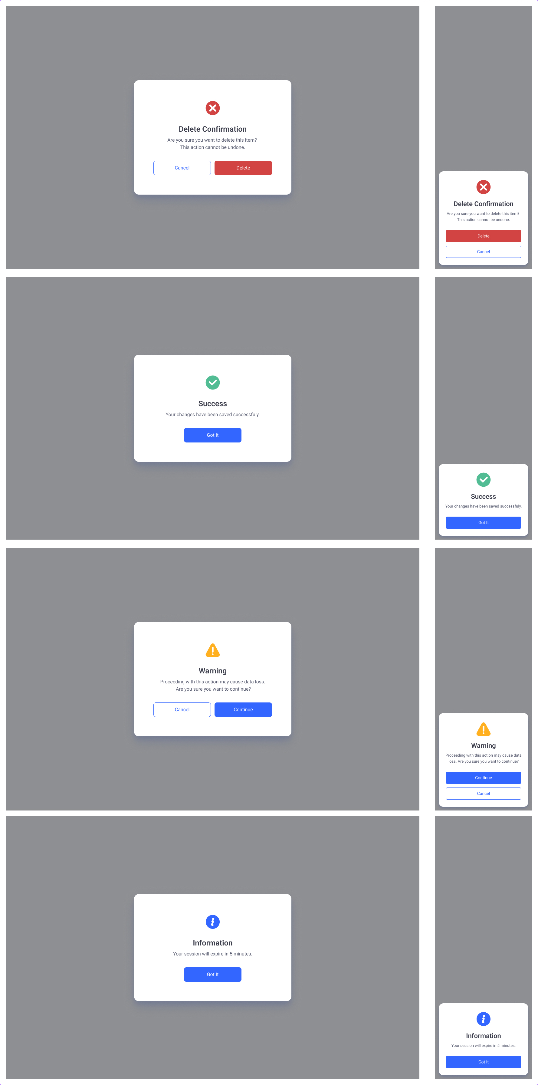
Message boxes — inline confirmation, warning, and information patterns for important user-blocking moments.
Notifications & status
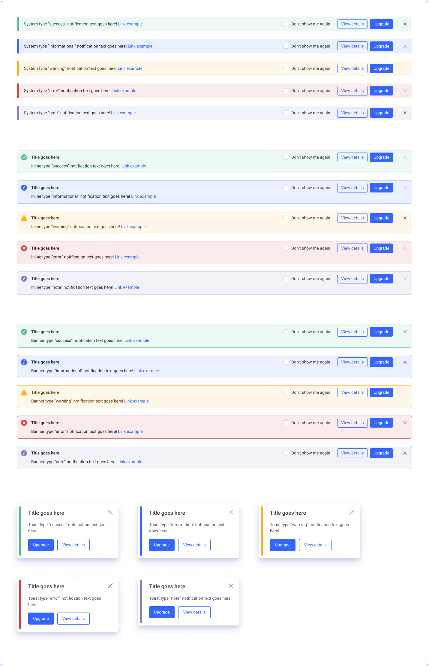
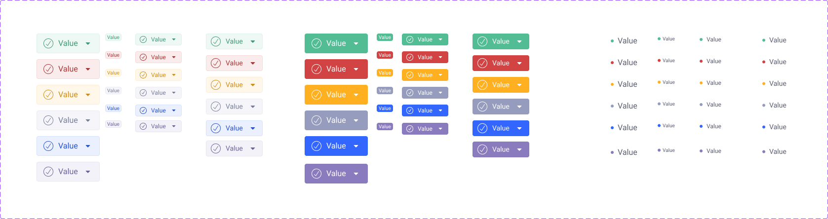
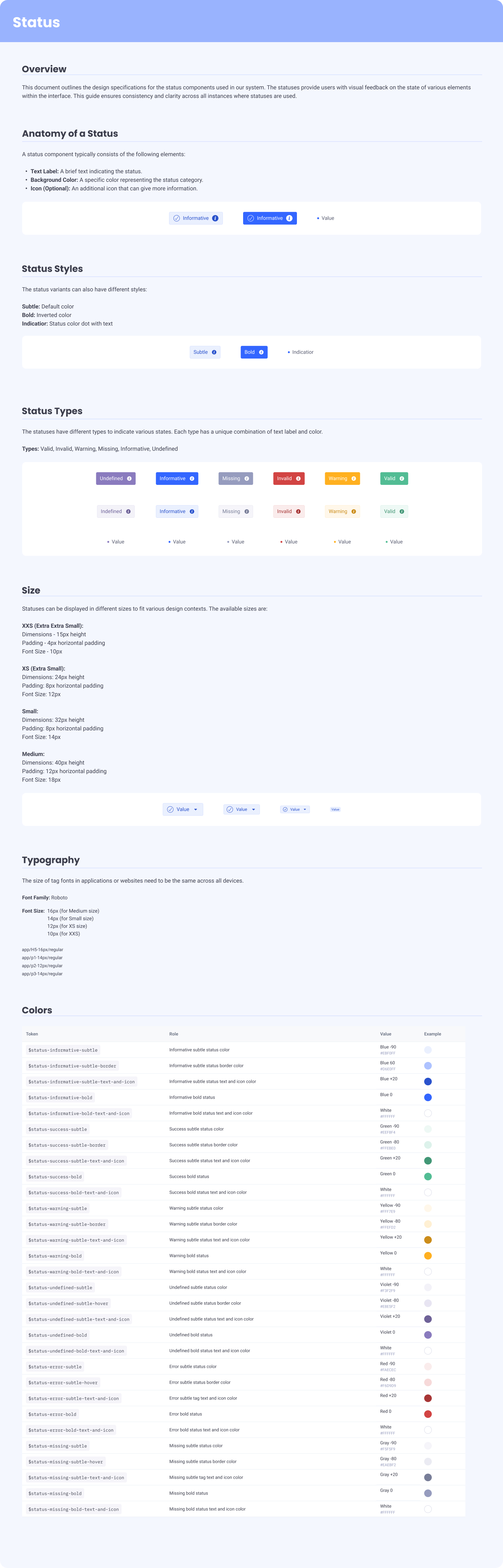
Notifications for transient feedback; status indicators for at-a-glance state across the product.
Tags

Tags — labels and filter chips, with semantic color variants matched to the token system.
Live in production, used across the platform.
The design system is live in EasyDMARC's product today. The color tokens, typography, and components on this page are the same ones the team uses to build new surfaces — across the email security, deliverability, and monitoring products in the EasyDMARC suite.
What I'd take into the next one
The most valuable part of this project wasn't any individual component — it was the discipline of designing each layer (source colors → palette → tokens, raw type scale → tokens → component usage) so that downstream changes are predictable and isolated. A token change shouldn't require redesigning components; a component change shouldn't require updating individual screens. That's the test of a real system, and it's the one I keep reaching for.
Happy to walk through the Figma library, the documentation, and the decisions I cut — in a conversation.
Get in touch →Like what you see?
I'm open to senior product design roles and select freelance engagements. Always happy to chat.
Get in touch →